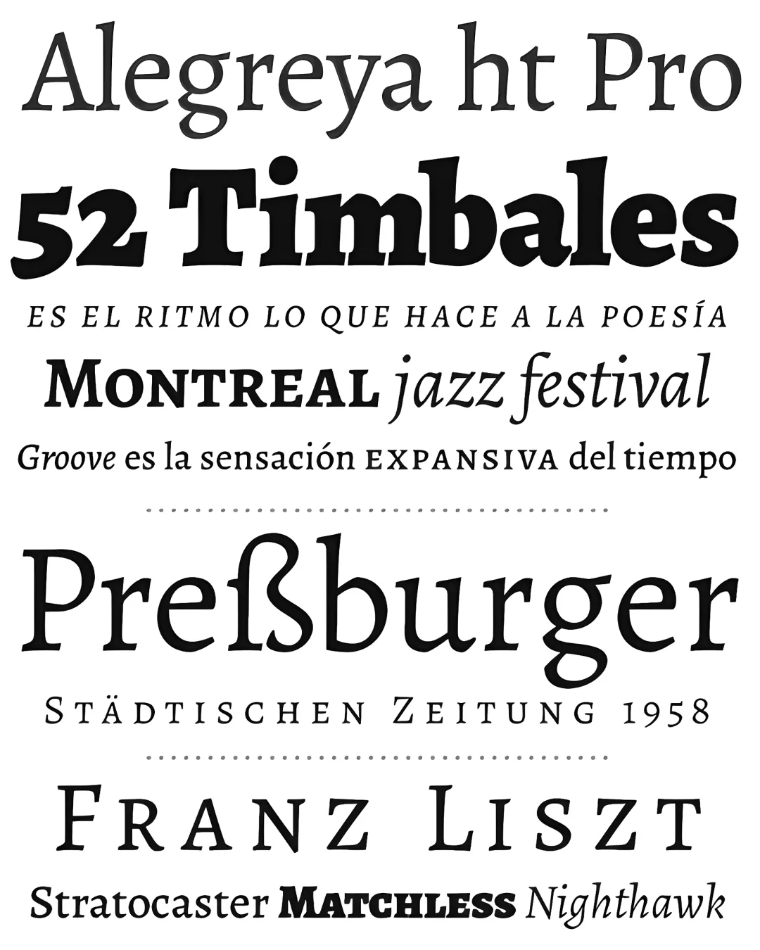
Alegreya was selected as one of the 53 “Fonts of the Decade” in ATypI’s Letter2 competition in September 2011, and as one of the 14 best typeface systems for text. It was also selected for the 2nd Ibero-American Design Biennial, held in Madrid in 2010. Alegreya is a typeface originally designed for literature. Among its key features, it conveys a dynamic and varied rhythm that makes long texts easier to read. Furthermore, it brings a fresh feel to the page while evoking calligraphic letterforms—not as a literal interpretation, but within a contemporary typographic language. The italic was designed with the same care and attention to detail as the roman. The Bold weights are robust, and the Black weights are truly experimental for the genre. It also features a complementary Small Caps family. Alegreya not only offers excellent performance but also achieves a strong and harmonious text through elements designed within a diverse framework. The Alegreya typeface system is a “superfamily,” originally conceived for literature, which includes sister families in both serif and sans serif styles.
Awards and Recognition
superfamilia
Tipografía