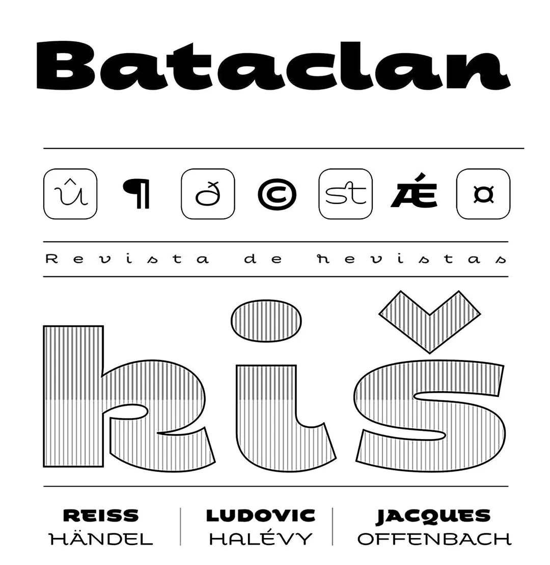
Fondue—known as Bataclan prior to its commercial launch—is a type family featuring eclectic shapes, inspired by Art Deco designs, particularly the lettering used by Mexican cartoonist Ernesto “El Chango” Cabral in nearly the entire publication *Revista de Revistas* (“Magazine of Magazines”). Far from being a copy, Fondue aims to be an adaptation of the design philosophy of that era for use in a contemporary context.
Fondue features a cursive stroke style, wide horizontal proportions, and a large x-height. Its friendly, consistent rhythm makes it ideal for medium-sized text, headlines, branding, and more.
The typeface family comes in 6 weights, ranging from Thin—which evokes the cartoonist’s loose strokes—to Ultra Bold, the version with a powerful and unique voice. Fondue features a character set of 496 characters that support 207 different languages. OpenType features include standard and discretionary ligatures as well as stylistic alternates.
Awards and Recognition
Tipografía para títulos