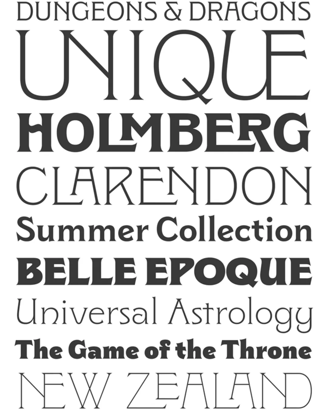
The Clockmaker typeface family represents an ambitious exploration of the visual memory of turn-of-the-century advertising. Centered on John F. Cummings’ Elandkay design—a set of capital letters never before digitized—the typeface weaves a narrative that intertwines Victorian ornamentation, the dynamism of Art Nouveau, and the structure of Art Deco. Academically, the project stands out for its glyph modernization process: building on the robustness of the historical uppercase letters, the system expands to include a coherent lowercase set and eight weight variants, creating a technical bridge between the eclecticism of the last century and the legibility demands of the digital age.
Awards and Recognition
2022
Bienal de Tipografía Latinoamericana. Selección
titulo
titulo