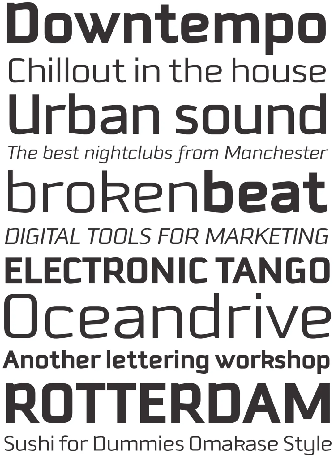
The Downtempo typeface family represents an exploration of industrial aesthetics applied to type design. Through its three weight variants, the typeface conveys an atmosphere of solidity and mechanical precision, moving away from organic warmth to embrace a contemporary structural rigor. From an academic perspective, Downtempo stands out for its ability to balance this visual rigidity with sophisticated typographic solutions, resulting in a body of text that feels technical yet accessible. It is a typeface designed for urban communication, publishing, and branding contexts that require an authoritative, stable voice deeply rooted in the aesthetics of manufacturing.
Awards and Recognition
2004
Bienal de Tipografía Latinoamericana. Selección
Texto
Texto