Developed for a typeface brand, but also with the idea that some of its shapes would function as containers for graphic elements in a wayfinding system, hence the character design is also solid, geometric, and simple, with the aim of creating a functional advantage in the application of both elements within the brand proposal.
The strokes of MxT Estación are geometric, based on a fairly simple square grid, with circular and straight modules that form each character in a simple and balanced way with little contrast in stroke weight; which in turn are tailored to the brand proposal being developed; as such, they also feature a system of proportions with relatively short uppercase letters compared to the x-height of the lowercase letters, as well as short ascenders and descenders. Overall, the result is a solid and compact character set, with a friendly feel and interesting visual accents in the typographic composition and text blocks.
Estación
ID / Record
#453
Credits
José Luis Coyotl
Licensing
Privado
Foundry
La Fe Ciega
Release
2008
Classification
Títulos
Class
Custom
Variants
2 Styles
Regional Node(s)
México, México
Verified Information
View Specimen
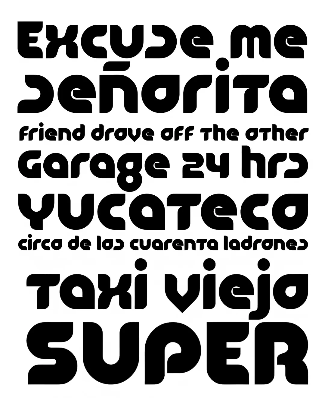
Note. Specimen of the typeface Estación. Copyright by
La Fe Ciega.
RECOMMENDED CITATION
TipoMap Latam. (2026). Estación. In Mapping of Typographic Production in Costa Rica (record #453). UASLP. Entry consulted at https://tipomap.lat/cr/view_typo?id=453