The Zulia typeface family, Joluvian’s debut work, is an exercise in introspection where geographical memory and technical rigor converge. Named after the region of the same name in western Venezuela, the typeface translates the vitality and thermal contrast of that environment into a system of characters with a strong gestural quality. Based on a hybrid of italic script and brush pen calligraphy, Zulia emerged from an analog exploration on paper, evolving from high-contrast hand-drawn strokes into a complex typographic system. The design is characterized by a low-mid-eye structure and a dense typographic area, achieving a formal distinction from standard commercial calligraphy and reaffirming the value of type as a vehicle for identity and emotion.
Zulia Pro
ID / Record
#533
Credits
Alejandro Paul
Licensing
Público con costo
Foundry
Sudtipos
Release
2013
Classification
Script
Class
Retail
Variants
2 Styles
Regional Node(s)
Argentina, Argentina
Verified Information
Access / License
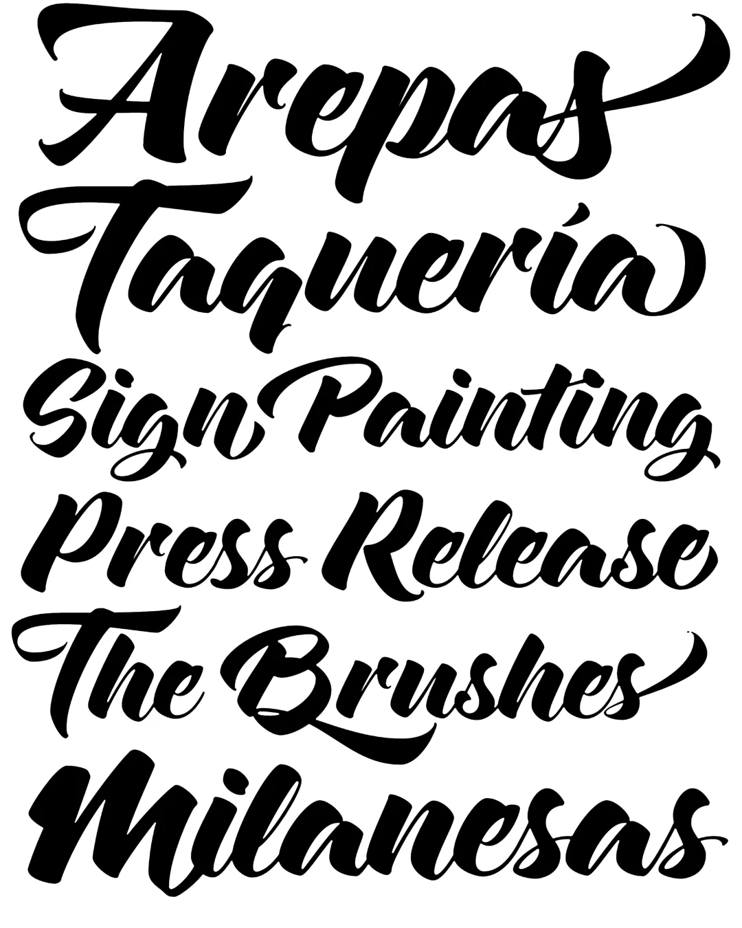
Note. Specimen of the typeface Zulia Pro. Copyright by
Sudtipos.
RECOMMENDED CITATION
TipoMap Latam. (2026). Zulia Pro. In Mapping of Typographic Production in Costa Rica (record #533). UASLP. Entry consulted at https://tipomap.lat/cr/view_typo?id=533