The Inlove typeface family is a contemporary synthesis of Ariel Di Lisio’s exploration of high-contrast geometric structures. Inspired by the tradition of mid-20th-century editorial design, this typeface pays tribute to the aesthetics of the “New York School”—a connection formalized following Di Lisio’s participation in the 2009 Herb Lubalin commemorative exhibition. Its architecture is defined by an abrupt transition between thin and thick strokes, creating a visual tension that makes it an ideal tool for large-format communication. Academically, Inlove represents a study of the economy of form applied to display typography, where the precision of geometric design serves to enhance visual impact and editorial sophistication.
Inlove
ID / Record
#537
Credits
Alejandro Paul
Licensing
Público con costo
Foundry
Sudtipos
Release
2010
Classification
Títulos
Class
Retail
Variants
3 Styles
Regional Node(s)
Argentina, Argentina
Verified Information
Access / License
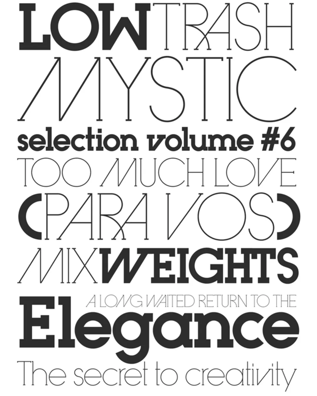
Note. Specimen of the typeface Inlove. Copyright by
Sudtipos.
RECOMMENDED CITATION
TipoMap Latam. (2026). Inlove. In Mapping of Typographic Production in Costa Rica (record #537). UASLP. Entry consulted at https://tipomap.lat/cr/view_typo?id=537