The Inoxida typeface family is presented as a critical and refined evolution of the Oxida typeface. While its predecessor established itself in the design of organic products due to its rustic character, Inoxida proposes a transition toward an aesthetic of fluidity and elegance. From a technical standpoint, the project should not be understood as a mere simplification of edges, but rather as a structural recomposition of the glyph’s anatomy. Koziupa and Paul’s work redefines the scale relationship between uppercase and lowercase letters, achieving superior visual cohesion that allows the typeface to thrive in packaging design contexts where sophistication and harmonious legibility are fundamental requirements.
Inoxida
ID / Record
#580
Credits
Alejandro Paul
Licensing
Público con costo
Foundry
Sudtipos
Release
2009
Classification
Script
Class
Retail
Variants
2 Styles
Regional Node(s)
Argentina, Argentina
Verified Information
Access / License
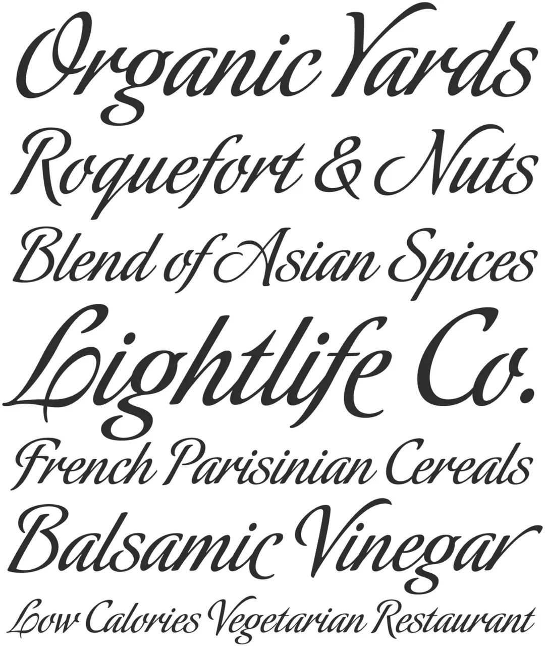
Note. Specimen of the typeface Inoxida. Copyright by
Sudtipos.
RECOMMENDED CITATION
TipoMap Latam. (2026). Inoxida. In Mapping of Typographic Production in Costa Rica (record #580). UASLP. Entry consulted at https://tipomap.lat/cr/view_typo?id=580