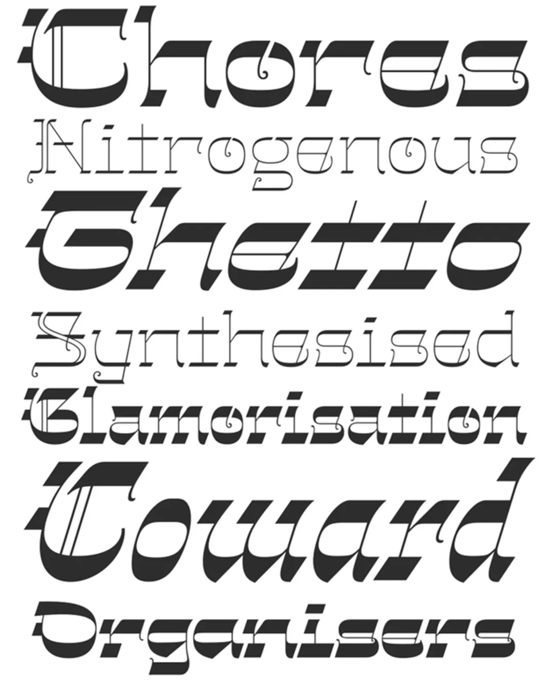
The Gothalian typeface family is an exercise in visual syncretism where two historically distant traditions converge: the architectural austerity of medieval blackletter and the ornamental boldness of 19th-century “Italian” typefaces with inverted contrast. Inspired by Henry Brehmer’s typeface (George Bruce’s Son & Co., c. 1890), the font is not limited to an archaeological revival but extrapolates the Victorian essence into contemporary architecture. Academically, Gothalian defies conventional typographic categories, creating a chiaroscuro aesthetic where the density of Gothic is counterbalanced by ornamental elegance, lending the typeface an aura of sophistication and mystery characteristic of late-Victorian design.
Awards and Recognition
2026
Bienal de Tipografía Latinoamericana. Selección
Título
Título