The Mama Script typeface family is a sophisticated experiment in the orthogonality of calligraphic strokes, moving away from the traditional slant to propose a striking vertical structure. The project draws on a diverse visual landscape ranging from the spontaneity of commercial signage to the technical rigor of master calligraphers. Academically, Mama Script stands as a work of morphological synthesis, where the fluidity of handwriting is systematized through cutting-edge digital engineering. It is a typeface designed for prominence, transforming the textual surface into a stage of graphic vitality and visual authority.
Mama Script
ID / Record
#653
Credits
Alejandro Paul
Licensing
Público con costo
Foundry
Sudtipos
Release
2005
Classification
Títulos, Script
Class
Retail
Variants
3 Styles
Regional Node(s)
Argentina, Argentina
Verified Information
Access / License
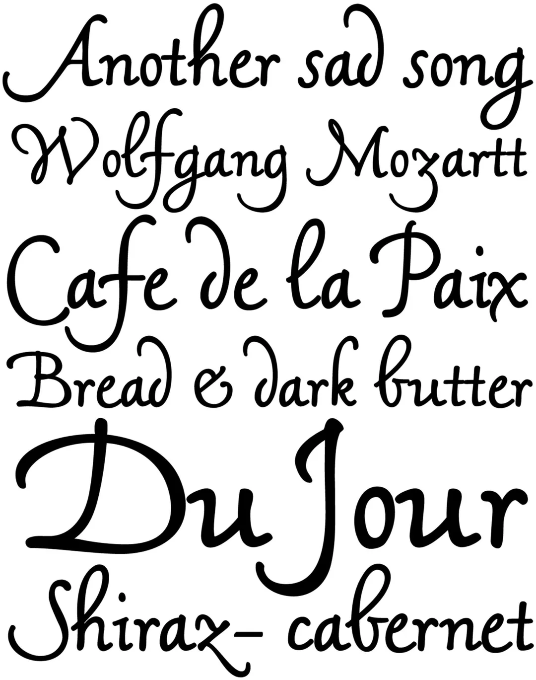
Note. Specimen of the typeface Mama Script. Copyright by
Sudtipos.
RECOMMENDED CITATION
TipoMap Latam. (2026). Mama Script. In Mapping of Typographic Production in Costa Rica (record #653). UASLP. Entry consulted at https://tipomap.lat/cr/view_typo?id=653