BECHAMEL ROMAN began as an interpretation of the all-caps lettering from the movie "Willy Wonka & the Chocolate Factory." Later, these ideas took shape with a flexible-nib pen and paper, blending their naive proportions with some classic elements from Baskerville, Bodoni, Didot, Round Hand Script, Graffiti, and labels found in Venezuela and Colombia. BECHAMEL ROMAN is designed to be paired with Bechamel. BECHAMEL Script, Vein, Words & Ornaments were hand-drawn to create words and phrases for logos, packaging, posters, envelopes, and greeting cards. BECHAMEL ROMAN 1, 2, 3 & 4 is an experimental typeface family designed by #carlosfabiancg. It features an irregular appearance to convey a sense of craftsmanship. Its multiple condensed-width capital letters and naive strokes stand out for their expressive design, featuring a strong contrast between thick and thin strokes.
Bechamel Roman
ID / Record
#3684
Credits
Carlos Fabián Camargo Guerrero
Licensing
Público con costo
Foundry
Andinistas
Release
2019
Classification
Títulos, Experimental
Class
Retail
Variants
4 Styles
Regional Node(s)
Colombia
Verified Information
Access / License
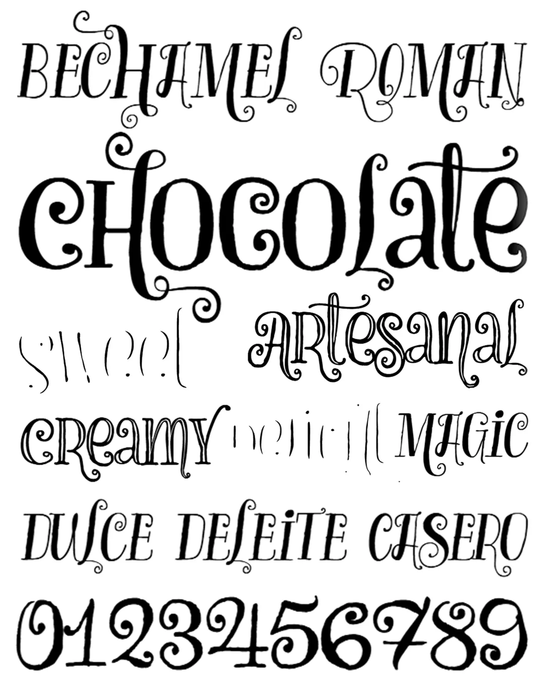
Note. Specimen of the typeface Bechamel Roman. Copyright by
Andinistas.
RECOMMENDED CITATION
TipoMap Latam. (2026). Bechamel Roman. In Mapping of Typographic Production in Cuba (record #3684). UASLP. Entry consulted at https://tipomap.lat/cu/view_typo?id=3684