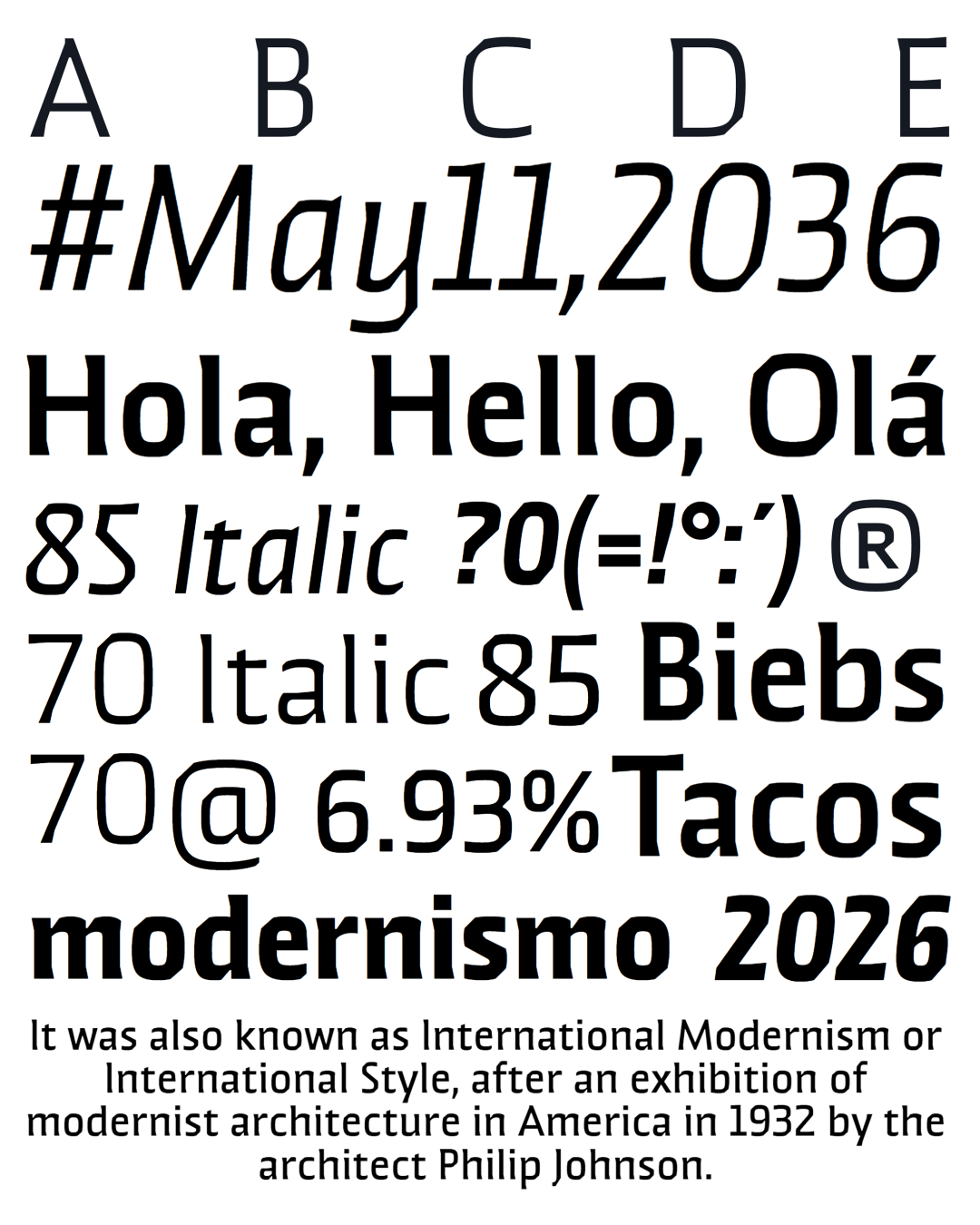
Brutman aims to be a typeface that reimagines the incise style of the 21st century.
It finds its roots in the humanistic style, adopting the structures of the roman capitals for its upright version and some features of the chancery style for its italics. Contrastingly, its contours are forged by the bluntness of the brutalist style, an aspect that is evident in the asymmetrical flared terminations, its sharp shoulders and the diagonal cuts that emulate the stress of the broad nib pen.
The result is a typeface that mixes a sleek character with historical flair. It conveys a feeling of modernity and sophistication in big sizes, but in its functional size has sharp shapes that allow it to perform very well in smaller instances.
Brutman
ID / Record
#3253
Credits
Sergio Ramírez LLamas
Release
2019
Variants
12 Styles
Regional Node(s)
Colombia
Note. Specimen of the typeface Brutman. Copyright by
Sergio Ramírez LLamas.
RECOMMENDED CITATION
TipoMap Latam. (2026). Brutman. Mapping of Typographic Production in Latin America. Consulted on 18-06-2026 de https://tipomap.lat/view_typo?id=3253