As graphic designers, it’s sometimes impossible not to draw inspiration from the Swiss Style—specifically from the work of Armin Hofmann, one of its greatest exponents.
Grid systems and grotesque and neo-grotesque typefaces are fundamental tools that make this aesthetic possible. It’s a visual language that has filled us with admiration ever since we were students.
That’s why we decided to design Armin as a tribute to Hofmann’s work. Technically, we added stylistic variations to the letters—G, R, a, g, h, l, m, n, r, t, u, and y—to make Armin a more eclectic typeface, better suited for creating any visual language.
Armin Grotesk
ID / Record
#2059
Credits
David Súid
Licensing
Público con costo
Foundry
W Type Foundry
Release
2018
Classification
Texto
Class
Retail
Variants
14 Styles
Regional Node(s)
Chile
Verified Information
Access / License
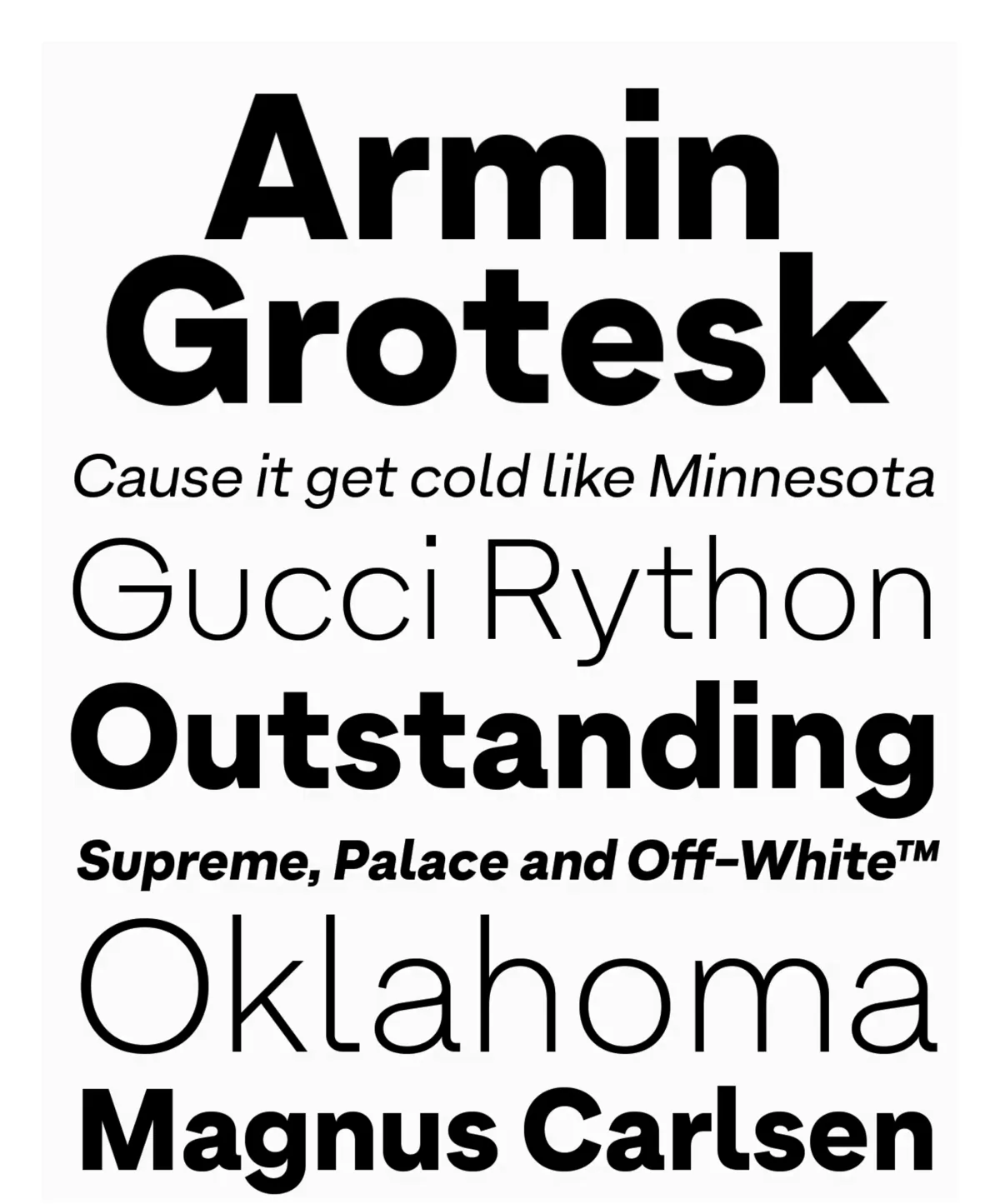
Note. Specimen of the typeface Armin Grotesk. Copyright by
W Type Foundry.
RECOMMENDED CITATION
TipoMap Latam. (2026). Armin Grotesk. In Mapping of Typographic Production in PT (record #2059). UASLP. Entry consulted at https://tipomap.lat/pt/view_typo?id=2059