The Helios typeface family is the result of a blend between early sans-serif fonts and modern trends of our time. Its rational structure is subtly wider than that of most early sans-serif fonts, creating a greater visual impact in its applications. All typographic terminals are more open to better balance the whites and blacks in Helios, and where strokes meet, there is a deeper contrast that enhances readability for the reader. In addition, some letters feature prominent design elements, such as the stem of the “R” and the tail of the “Q”—distinctive touches that set this typeface family apart. Helios Stencil is the bold version of this typeface family. All the stencil openings were rigorously measured, so at small sizes it conveys a neutral aesthetic, while at large sizes a visual logic emerges. Helios Antique consists of 36 styles, 782 glyphs, and small caps. It also features powerful OpenType features for each style, such as alternate characters, ligatures, fractions, special numbers, arrows, extended language support, and much more.
Helios Antique
ID / Record
#2071
Credits
Salvador Rogríguez, Felipe Sanzana
Licensing
Público con costo
Foundry
W Type Foundry
Release
2018
Classification
Texto, Títulos
Class
Retail
Variants
36 Styles
Regional Node(s)
Chile
Verified Information
Access / License
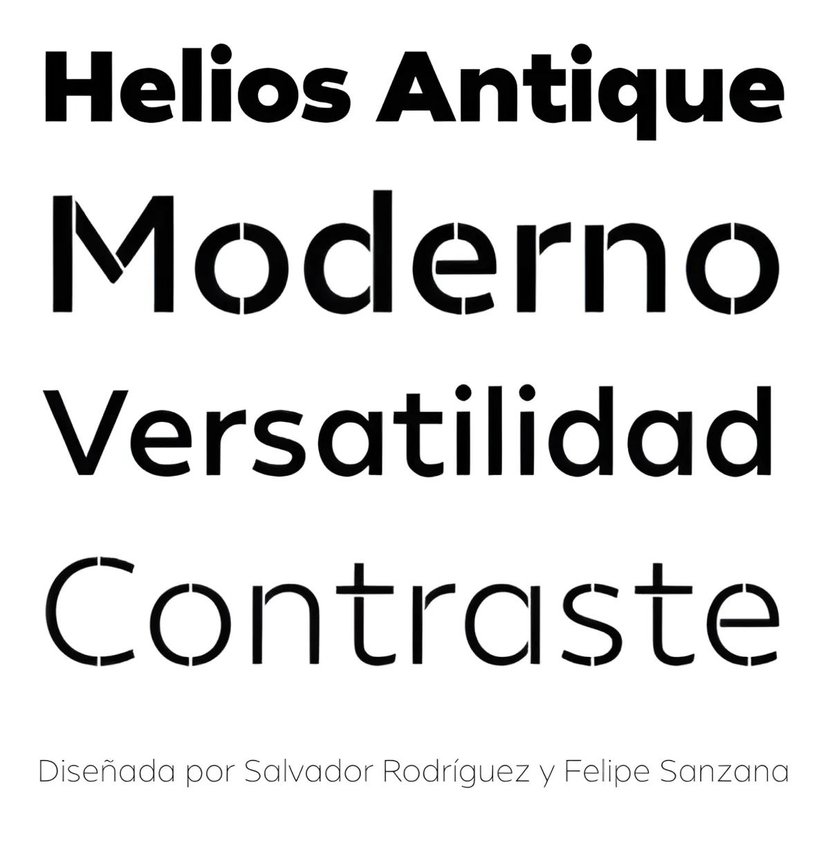
Note. Specimen of the typeface Helios Antique. Copyright by
W Type Foundry.
RECOMMENDED CITATION
TipoMap Latam. (2026). Helios Antique. In Mapping of Typographic Production in PT (record #2071). UASLP. Entry consulted at https://tipomap.lat/pt/view_typo?id=2071