Arquitecta Standard. Humanist typography as a rational project.
Drawing on the Bauhaus’s experimentation and the modern history of sans-serif typefaces, we sought a new blend to create a rational, geometric typeface with humanist proportions, suitable for text layout and continuous reading.
Inspired by American and European hand lettering from the first half of the last century, Arquitecta carves out its own niche as a great alternative for paragraphs alongside classics such as Futura, Kabel, and Avant Garde.
The family includes 8 upright Roman weights and 8 italics with the following characteristics:
- European accents.
- Optimized ink traps to prevent smudging and ink bleed-through.
- Small x-height with accentuated ascenders and descenders.
Arquitecta Standard Update:
Improved proportions and design.
The set was expanded to its current Latinotype version.
Arquitecta Standard
ID / Record
#2151
Credits
Miguel Hernández, Daniel Hernández
Licensing
Público con costo
Foundry
Latinotype
Release
2014
Classification
Texto, Títulos
Class
Retail
Variants
16 Styles
Regional Node(s)
Chile
Verified Information
Access / License
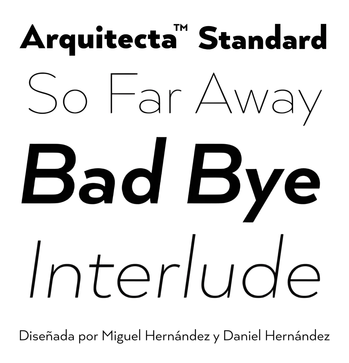
Note. Specimen of the typeface Arquitecta Standard. Copyright by
Latinotype.
RECOMMENDED CITATION
TipoMap Latam. (2026). Arquitecta Standard. In Mapping of Typographic Production in PT (record #2151). UASLP. Entry consulted at https://tipomap.lat/pt/view_typo?id=2151