Traducción pendiente - Mostrando original en Inglés
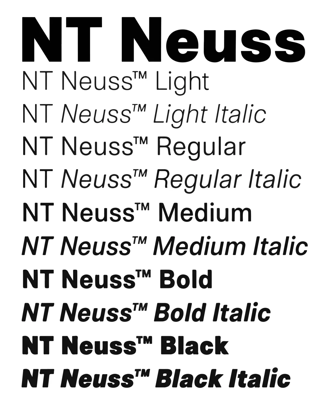
«Generic» and «ordinary» are terms commonly avoided in the canons of design. NT Neuss is a rebellion and aesthetic response to this stance. The charm of this typography lies in its ability to be recognizable. Slightly condensed, it has an excellent performance in line, making it highly functional. Influenced by anonymous system fonts, NT Neuss’ appeal lies in its versatility. With five weights and italics, NT Neuss is a typographic family perfectly suitable for complex visual systems and editorial projects.