Pocket was one of his first typefaces, designed around the year 2000, which experimented with sharp contrasts between simple modulation and asymmetrical proportions, extreme contrasts, and square and rounded ends on its thick, solid vertical strokes, paired with light horizontal strokes, creating interesting counterforms. Although it was a project that experimented with proportions and shapes—with a typographic character strongly defined by the vertical strokes—it produced blocks of text with high contrast and an unmistakable display personality.
ID / Record
#464
Credits
José Luis Coyotl
Licensing
Privado
Foundry
La Fe Ciega
Release
2000
Classification
Títulos
Class
Custom
Variants
1 Styles
Regional Node(s)
México, México
Verified Information
View Specimen
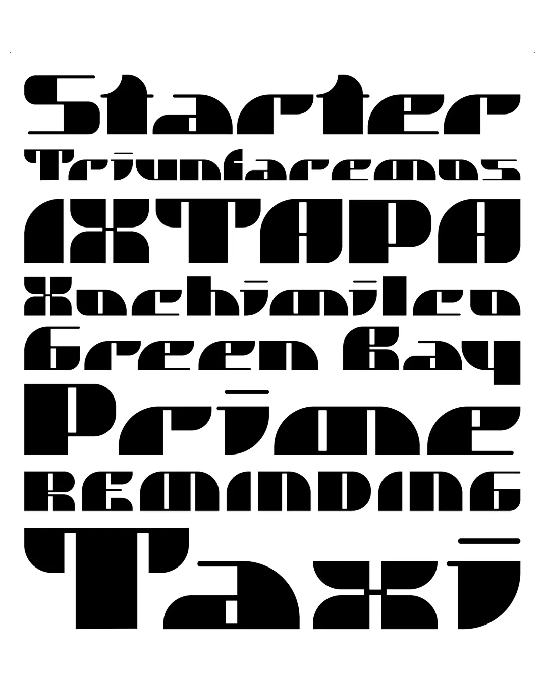
Note. Specimen of the typeface Pocket. Copyright by
La Fe Ciega.
RECOMMENDED CITATION
TipoMap Latam. (2026). Pocket. In Mapping of Typographic Production in SV (record #464). UASLP. Entry consulted at https://tipomap.lat/sv/view_typo?id=464