The Uplink typeface family is defined as a decorative vertical lettering style that coherently integrates calligraphic heritage with a morphology of friendly, legible strokes. The system stands out for its use of alternate glyphs featuring artificial “tail” connections; this technical feature allows the serif of one character to extend through the vertical stem of the next, introducing an organic and anthropomorphic element into the digital composition. This “humanization” of the stroke breaks with geometric rigidity, providing a visual warmth that fosters an emotional connection with the viewer. Its structure, endowed with uncommon flexibility, maintains its aesthetic integrity even under controlled deformation, establishing itself as a versatile solution for the food branding sector.
Uplink
ID / Record
#529
Credits
Alejandro Paul
Licensing
Público con costo
Foundry
Sudtipos
Release
2009
Classification
Títulos, Script
Class
Retail
Variants
2 Styles
Regional Node(s)
Argentina, Argentina
Verified Information
Access / License
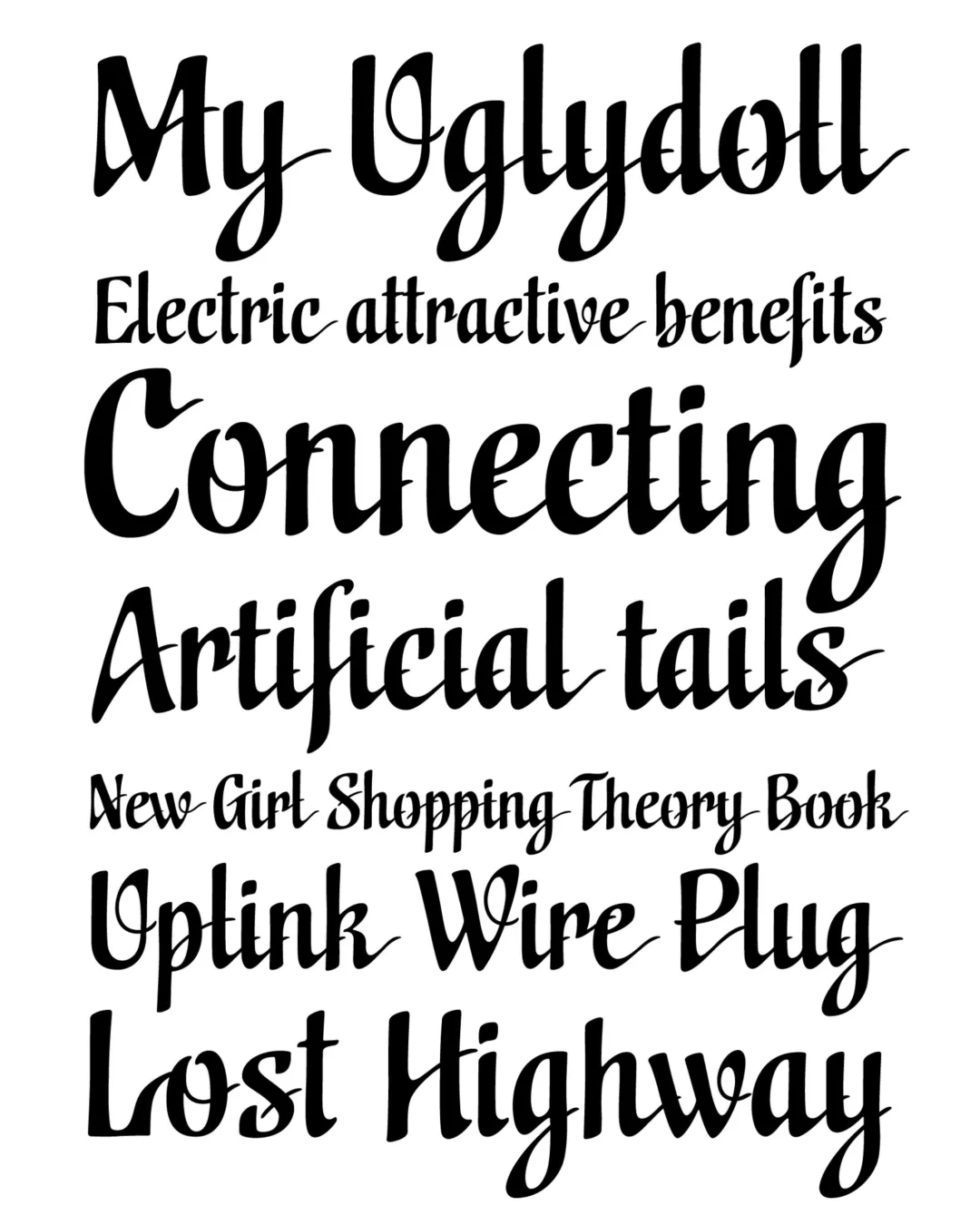
Note. Specimen of the typeface Uplink. Copyright by
Sudtipos.
RECOMMENDED CITATION
TipoMap Latam. (2026). Uplink. In Mapping of Typographic Production in SV (record #529). UASLP. Entry consulted at https://tipomap.lat/sv/view_typo?id=529