Co-designed by Koziupa and Paul, the Ricotta typeface family is a brush script with a robust structure that avoids ornamental excesses and unnecessary thickness. Its formal construction exhibits a restrained dynamism, where the gestural quality of the stroke is both functional and intrinsic to its expressiveness. The result is a system of glyphs that strikes a balance between compact composition, organic morphology, and high visual effectiveness.
Ricotta stands out for the integration of subtle details at strategic focal points, positioning it as an optimal typographic solution for packaging design contexts. Its formal nature harmonizes naturally with vibrant color palettes, making it particularly effective for the visual identity of dairy products and the food service industry.
Ricotta Script
ID / Record
#542
Credits
Alejandro Paul
Licensing
Público con costo
Foundry
Sudtipos
Release
2011
Classification
Script
Class
Retail
Variants
1 Styles
Regional Node(s)
Argentina, Argentina
Verified Information
Access / License
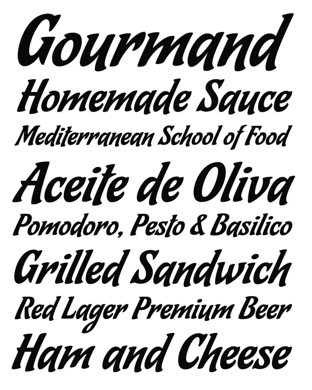
Note. Specimen of the typeface Ricotta Script. Copyright by
Sudtipos.
RECOMMENDED CITATION
TipoMap Latam. (2026). Ricotta Script. In Mapping of Typographic Production in SV (record #542). UASLP. Entry consulted at https://tipomap.lat/sv/view_typo?id=542