The Aventura typeface family is distinguished by a markedly volumetric and circular geometric construction, whose aesthetic evokes organic sophistication and a lasting visual warmth. Its design is geared toward establishing empathetic, high-impact communication, grounded in the smoothness of its terminations and the fluidity of its counterforms.
From a technical perspective, the system incorporates an extensive repertoire of stylistic alternates. These features allow designers to modulate the visual weight of the typeface, whether to emphasize the font’s expressive dynamism or to tone down its presence in favor of a more subtle composition. In both cases, the design of Aventura maintains a formal cohesion that prioritizes harmony and readability.
Aventura
ID / Record
#558
Credits
Alejandro Paul
Licensing
Público con costo
Foundry
Sudtipos
Release
2011
Classification
Títulos, Script
Class
Retail
Variants
2 Styles
Regional Node(s)
Argentina, Argentina
Verified Information
Access / License
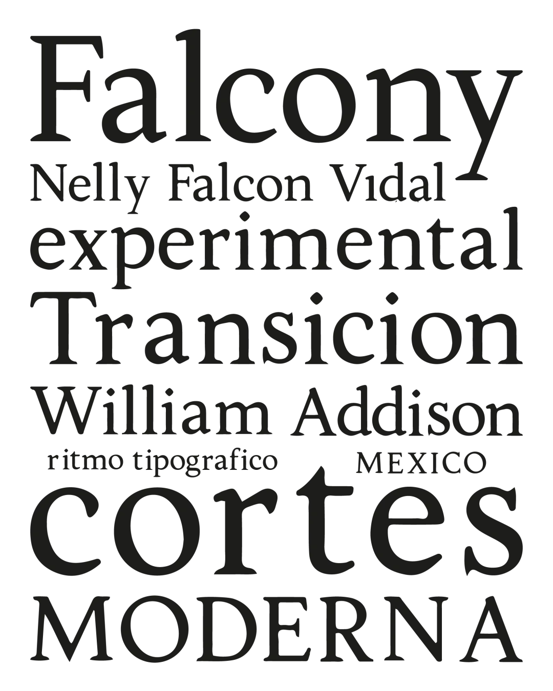
Note. Specimen of the typeface Aventura. Copyright by
Sudtipos.
RECOMMENDED CITATION
TipoMap Latam. (2026). Aventura. In Mapping of Typographic Production in SV (record #558). UASLP. Entry consulted at https://tipomap.lat/sv/view_typo?id=558