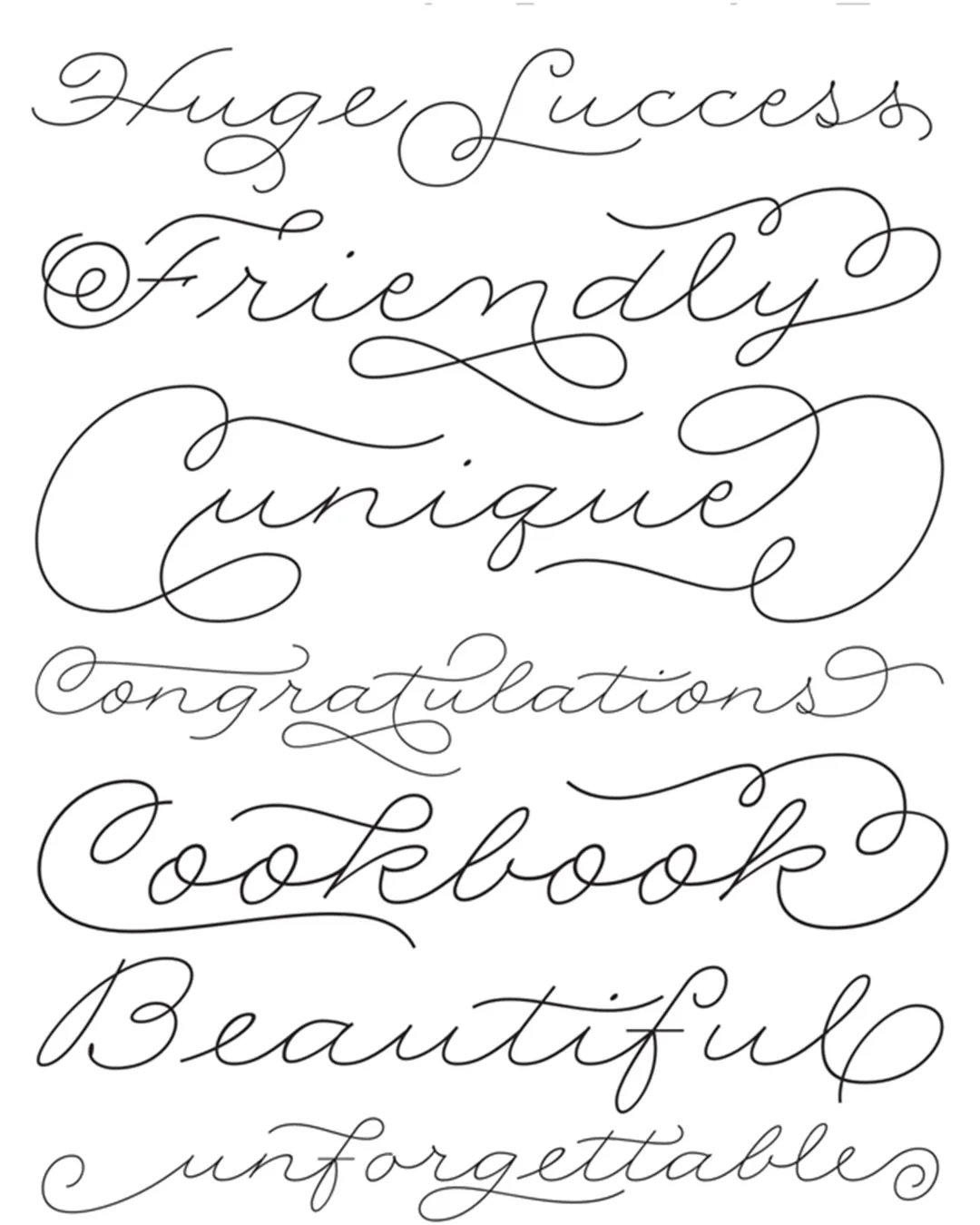
The Rolling Pen typeface family, designed by Alejandro Paul, offers a critical reflection on the gap between traditional calligraphic arts and contemporary design technologies. The typeface explores the legacy of fluid writing instruments and how their characteristic saturation—historically irregular—has been reinterpreted in the digital age as a geometry of rounded serifs and measured proportions. Rolling Pen moves away from the rigidity of nineteenth-century Business Penmanship to revive a more approachable and legible experimental variant, where the fluidity of the stroke becomes a metaphor for graceful movement. Academically, the work stands out for demonstrating how aesthetic “mutations”—which we now perceive as technological innovations—actually have historical precedents in treatises on ornamental calligraphy.
Awards and Recognition
Typeface Design