The Hopfen typeface family represents the culmination of extensive research into mid-20th-century German lettering, specifically the work of Bentele. While previous projects such as Semilla explored historical fidelity, Hopfen proposes a pragmatic evolution, translating the calligraphic gesture into a versatile five-weight type system. Academically, the typeface stands out for its ability to reconcile the fluidity of hand-drawn strokes with the necessary rigidity of heavy-weight typefaces. This project represents a “temporal bridge” that provides the expressiveness of the past with a modern technical infrastructure, allowing the lyricism of classic lettering to find a natural home in media as diverse as the corporate identity of breweries and contemporary movie posters.
Hopfen
ID / Record
#587
Credits
Alejandro Paul
Licensing
Público con costo
Foundry
Sudtipos
Release
2022
Classification
Títulos, Script
Class
Retail
Variants
6 Styles
Regional Node(s)
Argentina, Argentina
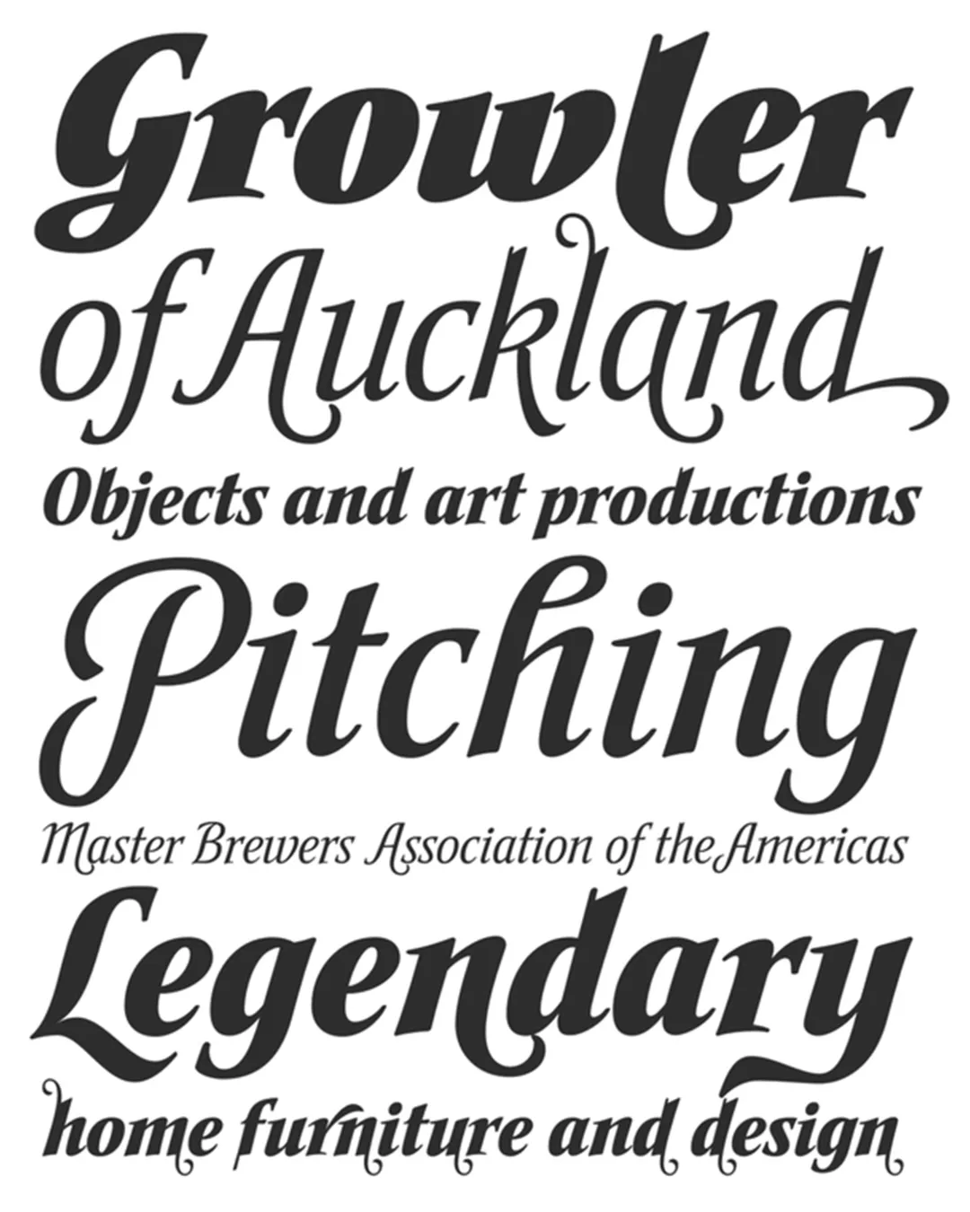
Note. Specimen of the typeface Hopfen. Copyright by
Sudtipos.
RECOMMENDED CITATION
TipoMap Latam. (2026). Hopfen. In Mapping of Typographic Production in SV (record #587). UASLP. Entry consulted at https://tipomap.lat/sv/view_typo?id=587