Kualica began as a custom typeface originally developed to explore and create a typographic brand. Although it might seem similar in style to other typefaces in the same geometric and modern vein, the unique features that emerged led to a subsequent expansion of its character set, and to rework it so that it would function in body text—as opposed to display text like that of a logo—with a more uniform and better-structured stroke that would allow it to be used in other projects with slightly wider text blocks. This, in turn, enabled the development of a set of uppercase letters, numbers, and some additional symbols in two variants: Regular and Italic.
Kualica
ID / Record
#3284
Credits
José Luis Coyotl
Licensing
Privado
Foundry
Mexicana Type
Release
2018
Classification
Texto, Títulos
Class
Custom
Variants
2 Styles
Regional Node(s)
México
Verified Information
View Specimen
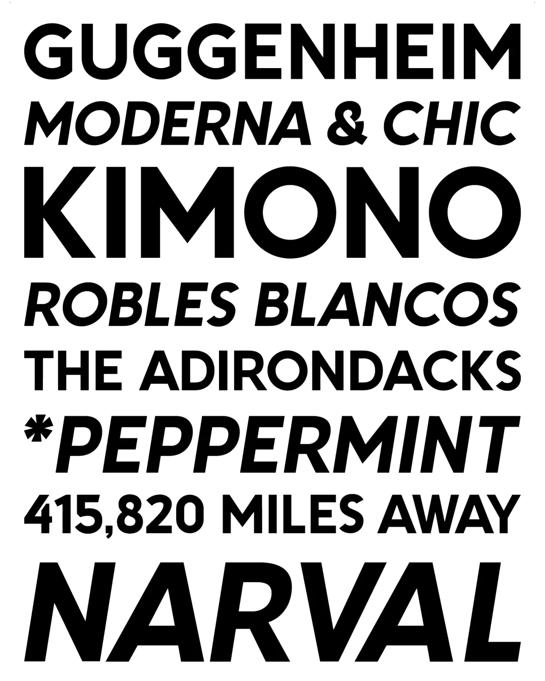
Note. Specimen of the typeface Kualica. Copyright by
Mexicana Type.
RECOMMENDED CITATION
TipoMap Latam. (2026). Kualica. In Mapping of Typographic Production in Argentina (record #3284). UASLP. Entry consulted at https://tipomap.lat/ar/view_typo?id=3284