Cisne is a display serif built on a tension: tightly packed vertical strokes set against large, open, near-perfect circular forms. It began as an ode to Stunt Roman, an Art Deco alphabet first appearing in the Speedball Lettering Manual of 1929. Designed by Ross F. George and known for its expressive swashes and refined curves — an alphabet made, in George’s own words: to show off.
Sproviero pushes that logic into new territory: swashes explored more deeply, serifs more pronounced, subtle ligatures appearing naturally without breaking the flow. Like a swan, it moves smoothly on the surface while holding a more complex structure underneath. As a variable font with weight and x-height axes — and a range of alternates — it offers that same depth at every size and weight. Suited to editorial and branding work that demands both presence and refinement.
Cisne
ID / Registro
#3220
Créditos
Maximiliano Sproviero
Licenciamiento
Público con costo
Fundidora
Sproviero Type
Lanzamiento
2026
Clasificación
Títulos, Experimental
Clase
Retail
Variantes
11 Estilos
Nodo(s) Regional(es)
Argentina
Información Verificada
Acceso / Licencia
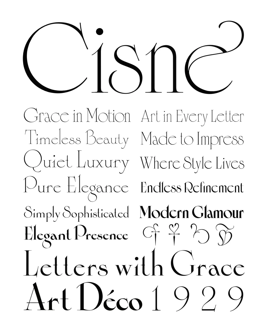
Nota. Espécimen de la tipografía Cisne. Derechos de autor por
Sproviero Type.
Traducción pendiente - Mostrando original en Inglés
CITA RECOMENDADA
TipoMap Latam. (2026). Cisne. En Mapeo de la Producción Tipográfica en Costa Rica (registro #3220). UASLP. Entrada consultada en https://tipomap.lat/cr/view_typo?id=3220