Bravissima is a typeface that evokes the graphic imagery of the 1970s, a period characterized by intense gesturality and a predominance of spontaneous brushstrokes in visual culture. Its formal structure draws on that dynamic expressiveness and translates it into a contemporary typographic system, where the energy of the handwritten stroke becomes the structural backbone of the composition.
The design blends Koziupa’s signature calligraphic tradition with the technical resources developed by Paul, creating a synthesis of manual dexterity and digital precision. This convergence is enriched by OpenType features, which expand compositional possibilities through alternate characters, contextual variations, and other advanced typographic resources. These features allow for the simulation of the natural flow of handwritten strokes and enhance formal diversity within a single system.
From a communicative perspective, Bravissima stands out for its high expressive power and its ability to convey immediacy, intensity, and warmth. Its profile makes it particularly well-suited for applications requiring an energetic and sensory visual identity, such as food packaging design—especially for products associated with intense flavors or bold culinary concepts.
In summary, the typeface offers a contemporary reinterpretation of 1970s aesthetics, integrating modern technological resources with vibrant calligraphic gestures, positioning it as an effective tool for projects that demand visual impact and a distinctive personality.
Bravissima Script
ID / Record
#523
Credits
Alejandro Paul
Licensing
Público con costo
Foundry
Sudtipos
Release
2010
Classification
Títulos, Script
Class
Retail
Variants
2 Styles
Regional Node(s)
Argentina, Argentina
Verified Information
Access / License
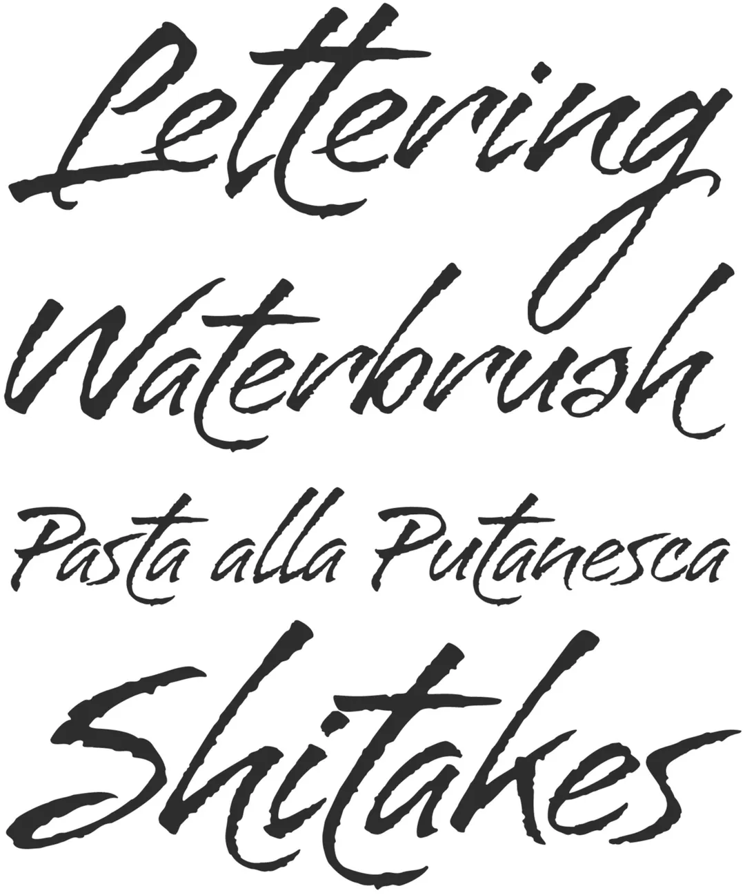
Note. Specimen of the typeface Bravissima Script. Copyright by
Sudtipos.
RECOMMENDED CITATION
TipoMap Latam. (2026). Bravissima Script. In Mapping of Typographic Production in Costa Rica (record #523). UASLP. Entry consulted at https://tipomap.lat/cr/view_typo?id=523