Bellas Artes emerges from the convergence of Angel Koziupa’s calligraphic gestures and Alejandro Paul’s technical expertise, in an exercise in the contemporary reinterpretation of Art Deco aesthetics. The project combines the organic expressiveness of hand-drawn strokes with a rigorous process of digital systematization, resulting in a typeface that balances ornamental sensibility with structural precision.
One of the design’s distinctive features lies in the treatment of the curves characteristic of Koziupa’s formal repertoire, organized here according to a logic of compositional duality. This formal strategy proposes a dynamic of “complementary halves,” in which contrasts and symmetries do not establish internal hierarchies, but rather relationships of visual interdependence. The result is a typographic system in which the tensions between form and counterform, full and empty, ornament and structure, contribute to a cohesive and refined identity.
From a functional perspective, Bellas Artes is ideally suited for applications that demand aesthetic sophistication and historical resonances linked to the pre-World War II period. Its profile makes it particularly well-suited for packaging design, book covers, and album covers aimed at female audiences or projects with a classical sensibility. Likewise, its controlled ornamental character makes it an effective tool for projects requiring a stylistic evocation of the Art Deco visual aesthetic, while maintaining contemporary standards of typographic quality.
Bellas Artes
ID / Record
#526
Credits
Alejandro Paul
Licensing
Público con costo
Foundry
Sudtipos
Release
2009
Classification
Títulos
Class
Retail
Variants
1 Styles
Regional Node(s)
Argentina, Argentina
Verified Information
Access / License
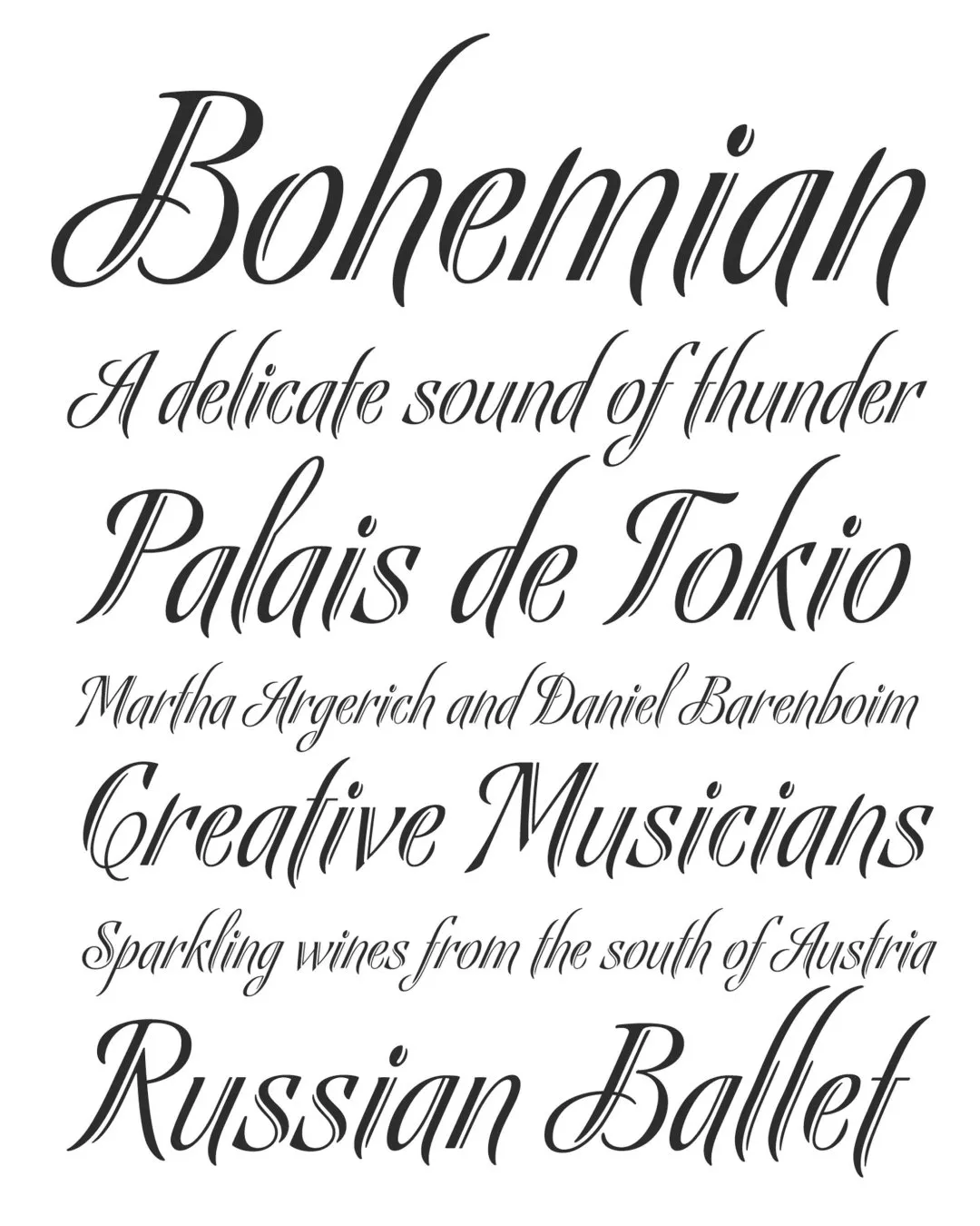
Note. Specimen of the typeface Bellas Artes. Copyright by
Sudtipos.
RECOMMENDED CITATION
TipoMap Latam. (2026). Bellas Artes. In Mapping of Typographic Production in Costa Rica (record #526). UASLP. Entry consulted at https://tipomap.lat/cr/view_typo?id=526