The Theorem typeface represents a significant evolution in Koziupa and Paul’s work, moving away from the calligraphic tradition to explore a formal synthesis between Art Deco and the graphic eclecticism of the 1990s. Its uppercase characters exhibit robust geometry, while the lowercase characters have been designed according to strict criteria of optical correction. The typeface is distinguished by a dynamic spacing architecture, achieved through the implementation of alternate glyphs and vowel ligatures that optimize the type area. Thanks to its OpenType programming, the font ensures automatic visual cohesion, positioning itself as an advanced technical tool for packaging design and contemporary display typography.
Theorem
ID / Record
#528
Credits
Alejandro Paul
Licensing
Público con costo
Foundry
Sudtipos
Release
2010
Classification
Títulos, Script
Class
Retail
Variants
2 Styles
Regional Node(s)
Argentina, Argentina
Verified Information
Access / License
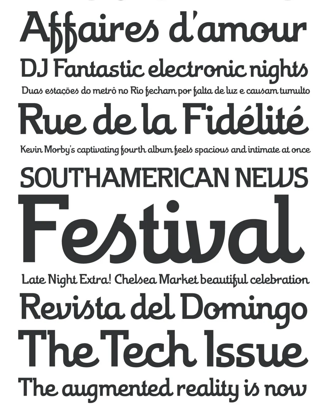
Note. Specimen of the typeface Theorem. Copyright by
Sudtipos.
RECOMMENDED CITATION
TipoMap Latam. (2026). Theorem. In Mapping of Typographic Production in Costa Rica (record #528). UASLP. Entry consulted at https://tipomap.lat/cr/view_typo?id=528