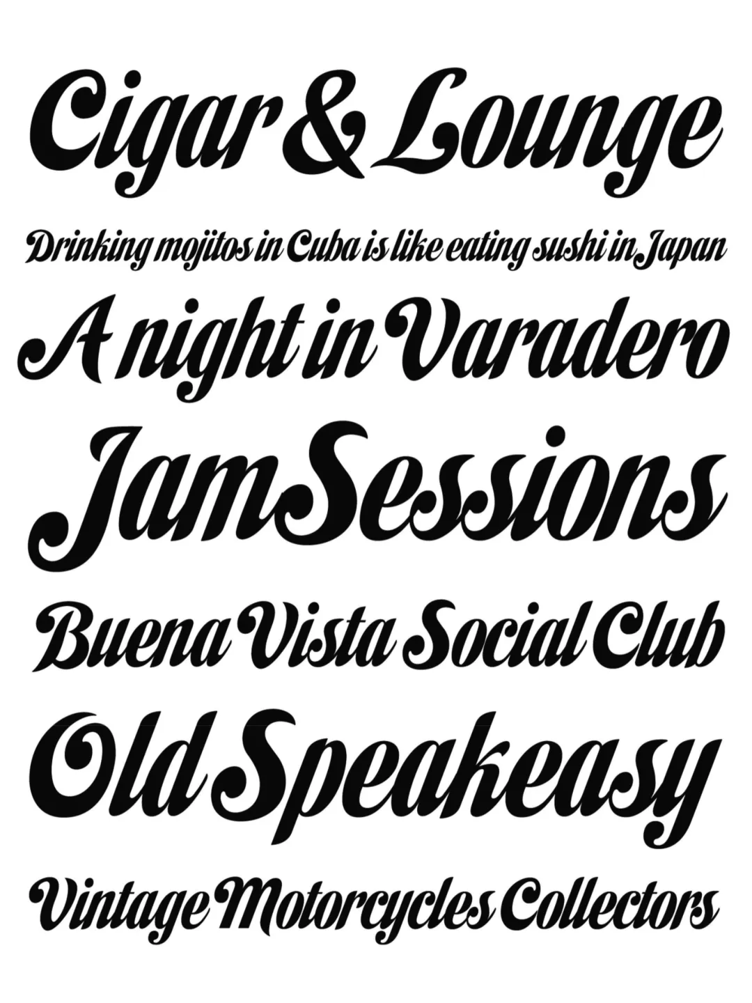
The Habano typeface family is defined as a bold script with fluid, sophisticated strokes, characterized by the integration of disruptive morphological solutions. Its stylistic origins lie in the convergence of two historical traditions: the geometric rigor of Art Deco and the expressiveness of commercial lettering associated with mid-20th-century mass culture.
From an analytical perspective, the typeface exhibits a marked contrast between its case levels. While the lowercase letters feature a structure of high formal cohesion and a controlled ductus, the uppercase letters and numerals are distinguished by a circular and playful geometry with great mnemonic impact. This duality of characters endows “Habano” with an iconic quality, allowing the word to transcend its linguistic function and become a lasting visual unit.
Once again, Angel Koziupa’s technical expertise and calligraphic vision are evident in an alphabetic system that, through the smoothness of its strokes and its organic coherence, leaves a lasting visual impression on the viewer.
Awards and Recognition
Titulo