The Cooked typeface family represents one of the boldest creations by the design duo Angel Koziupa and Alejandro Paul. This typeface system is defined by an organic and vibrant style, designed to enrich complex visual compositions that call for a strong sensory impact. Its design seeks to trigger a synesthetic response in the viewer, appealing to tactile and gustatory perception through a morphology of dense, fluid strokes.
From a technical perspective, the system stands out for its robust OpenType programming, designed to maximize the visual impact of the typographic form. Thanks to the inclusion of an extensive repertoire of stylistic variants for each character, Cooked allows for detailed customization of the composition, avoiding formal redundancy and enhancing the dynamism of the text.
Its functional versatility positions it as an ideal solution for packaging design, signage, editorial design, and visual identities associated with the leisure and adventure sectors. In essence, Cooked is a tool for projects that require assertive communication, exploring the more organic and hedonistic side of typographic form.
Cooked
ID / Record
#615
Credits
Alejandro Paul, Angel Koziupa
Licensing
Público con costo
Foundry
Sudtipos
Release
2006
Classification
Script
Class
Retail
Variants
4 Styles
Regional Node(s)
Argentina, Argentina
Verified Information
Access / License
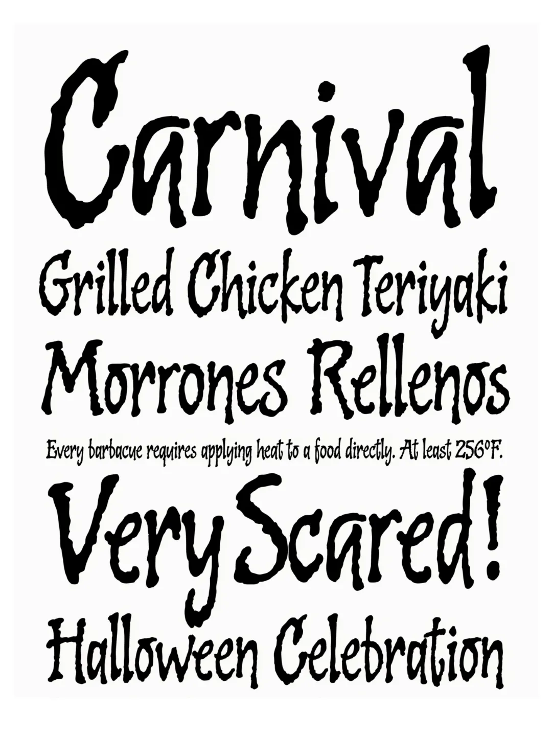
Note. Specimen of the typeface Cooked. Copyright by
Sudtipos.
RECOMMENDED CITATION
TipoMap Latam. (2026). Cooked. In Mapping of Typographic Production in Costa Rica (record #615). UASLP. Entry consulted at https://tipomap.lat/cr/view_typo?id=615