The Rigatoni typeface family represents a sophisticated exploration of the legacy of mid-20th-century German lettering, specifically the work of E. Nerdinger. Alejandro Paul goes beyond the original specimen by designing a comprehensive system of five weights and italics, incorporating a stencil variant with great visual impact. From an academic perspective, Rigatoni stands out for its noble bearing in the use of uppercase letters, contrasted with a lowercase structure featuring generous x-height and wide counterforms that ensure exceptional legibility. It is a typeface that captures the technical rigor of European rationalism and translates it into a contemporary visual grammar, ideal for brand identities that demand authority and clarity.
Rigatoni
ID / Record
#625
Credits
Alejandro Paul
Licensing
Público con costo
Foundry
Sudtipos
Release
2017
Classification
Títulos, Script
Class
Retail
Variants
12 Styles
Regional Node(s)
Argentina, Argentina
Verified Information
Access / License
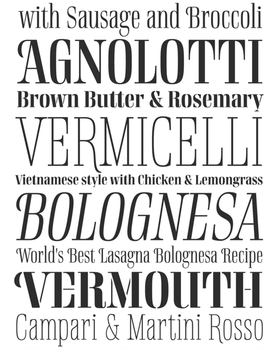
Note. Specimen of the typeface Rigatoni. Copyright by
Sudtipos.
RECOMMENDED CITATION
TipoMap Latam. (2026). Rigatoni. In Mapping of Typographic Production in Costa Rica (record #625). UASLP. Entry consulted at https://tipomap.lat/cr/view_typo?id=625