The designer developed the typeface by experimenting with the shapes suggested by the geometry of the Mexico City Metro logo. The resulting typeface is described as architectural and legible, looking good in subway stations. In a quote, designer Lance Wyman explains that the font was born out of visual research based on the M of the logo, with the goal of achieving a functional and architectural aesthetic.
Updated in 2018 as Integrated Mobility. It is used by all transport systems, such as Metrobus, Trolleybus, Cablebus, RTP, Ecobici, Tren Interurbano and Metro.
Metro
ID / Record
#332
Credits
Lance Wyman
Licensing
Privado
Release
1968
Classification
Títulos
Class
Custom
Variants
1 Styles
Regional Node(s)
México
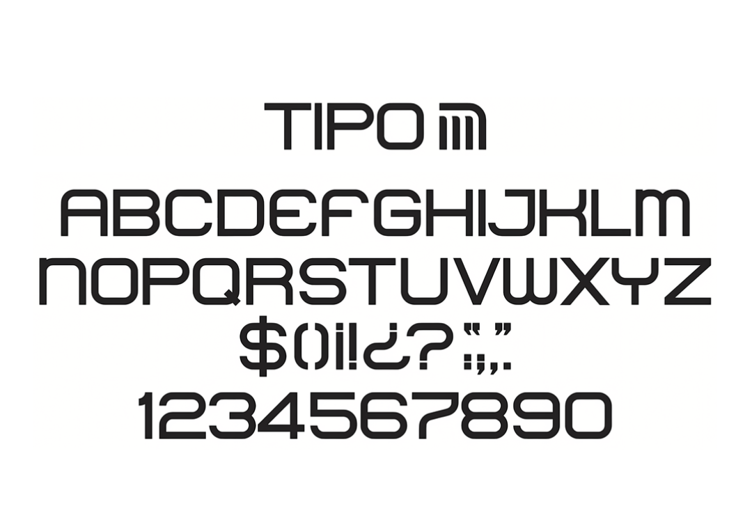
Note. Specimen of the typeface Metro. Copyright by
Lance Wyman.
RECOMMENDED CITATION
TipoMap Latam. (2026). Metro. Mapping of Typographic Production in Latin America. Consulted on 15-06-2026 de https://tipomap.lat/view_typo?id=332