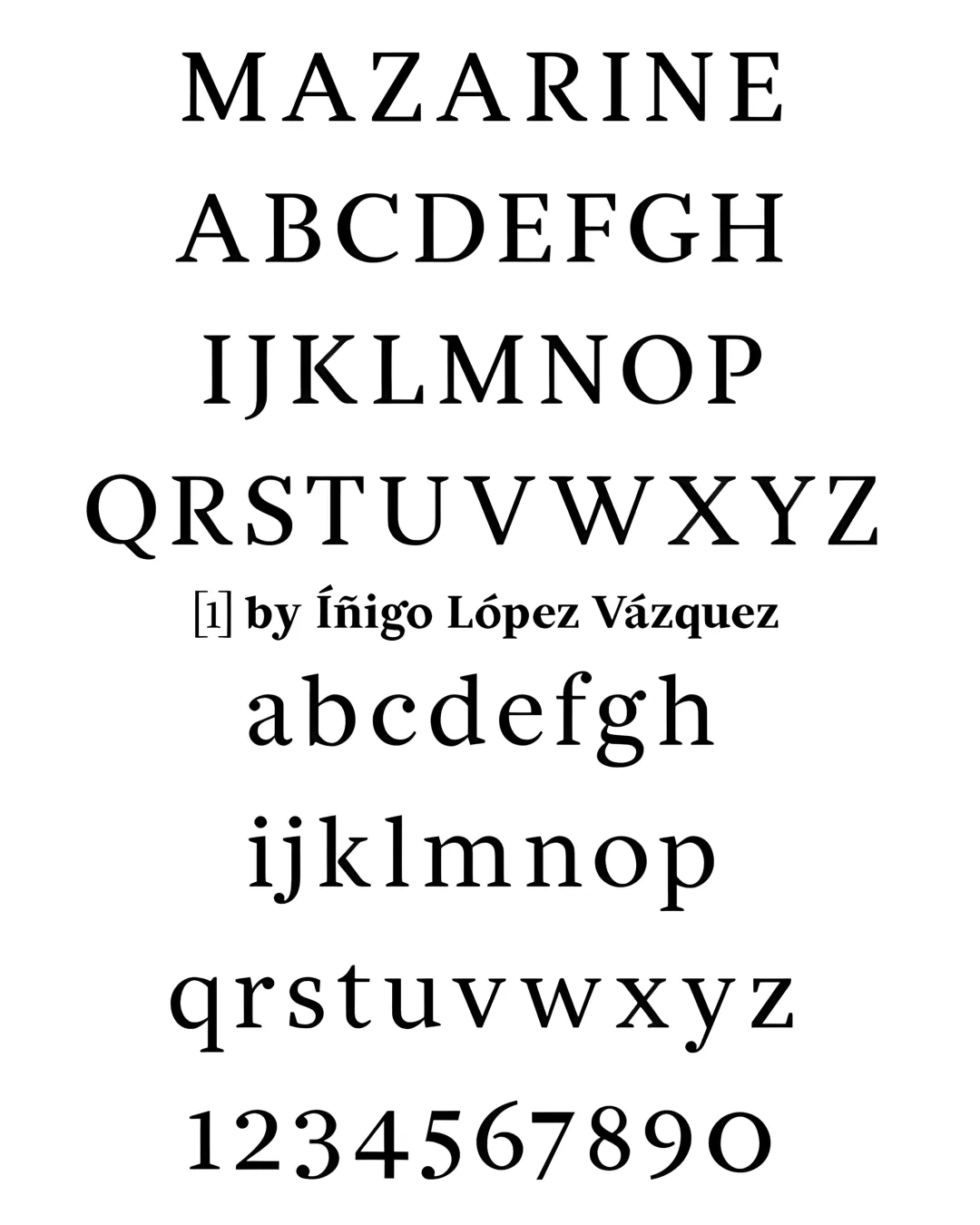
Mazarine was designed to be used as a newspaper font that could work for short texts while offering the readability & comfort of Renaissance fonts (much in the spirit of fonts like Times or Georgia). Its large x-height & contemporary proportions however, make it a lot more versatile than the usual Renaissance faces.
The letters were first hand-drawn using traditional calligraphy as a model & template. On the top of those models, a simpler & rougher letter was drawn which favored typographic straight lines. This precision is contrasted by an exaggerated 13 degree angle in the rounds letters, which gives the typeface back its warm texture & rhythm.
Academic Context
Type Design
TypeParis (Francia) — 2016