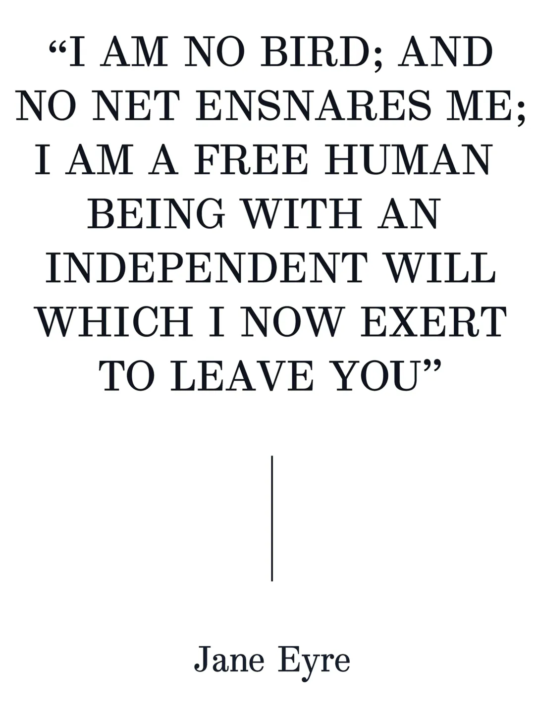
The original material comes from the first edition of Charlotte Brontë’s *Jane Eyre*. The typeface used to print this book is a 19th-century Modern Roman. The main characteristics of this typeface are its high contrast, wide capital letters, and prominent rounded serifs. I chose this typeface because Jane Eyre is my favorite book, but the real inspiration came when I discovered that the typeface used was a Scotch Roman identified only by a number—a common typeface without distinction or prestige, simply one more typeface in the repertoire. This inspired me to give this beautiful typeface its own voice in the modern world. Is the original letterform rounded? Or is it simply ink bleed? The discovery of sharp, angular corners led me to believe that this was the result of normal ink expansion in the cheap or low-quality printing used for this book. After spending a long time examining and analyzing each letter, I realized that this print featured a great deal of ink bleed. Therefore, I decided to create a Modern Roman with geometric serifs.
Academic Context
Type West Online
Letterform Archive (Estados Unidos) — 2023