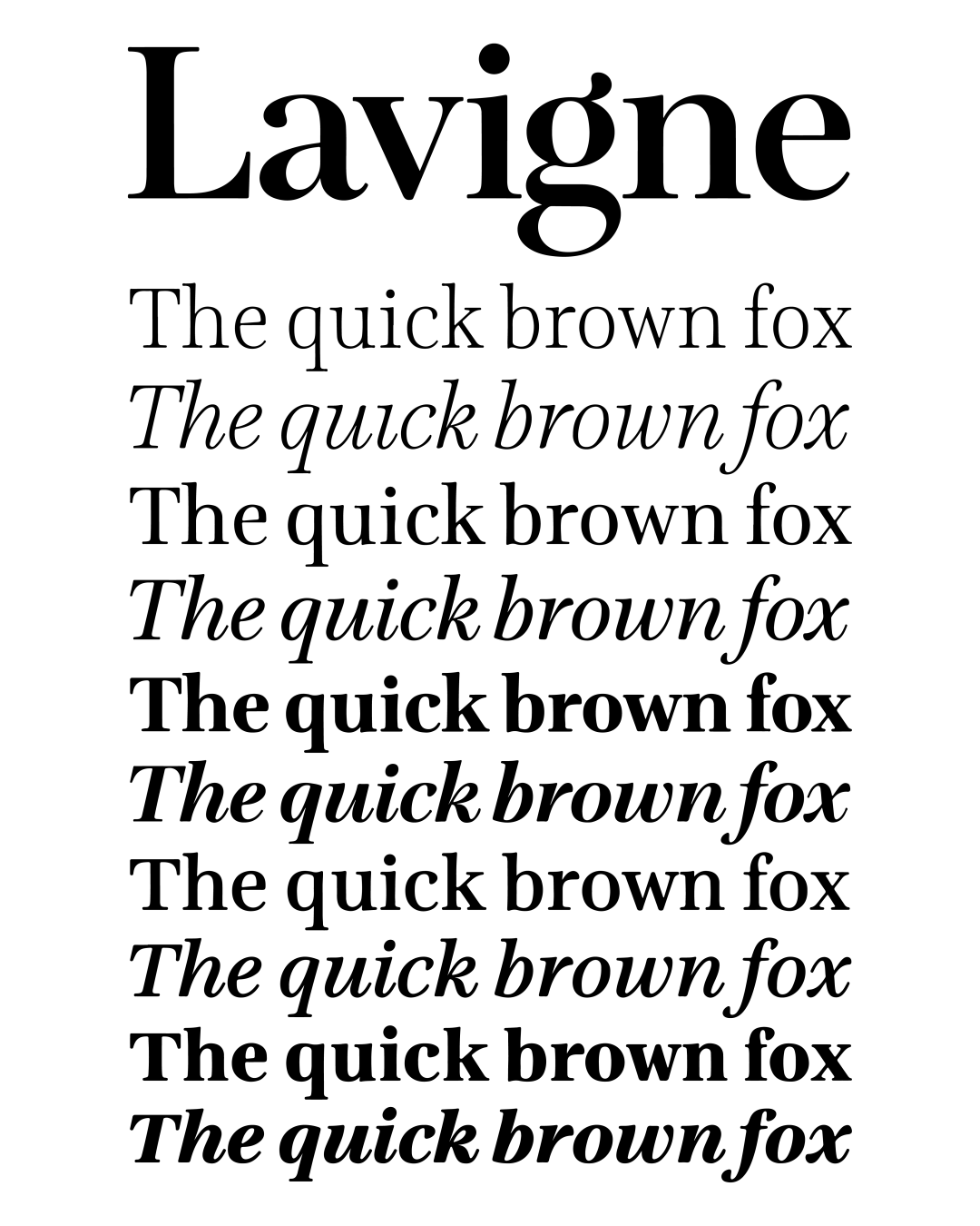
In 2023 Ramiro Espinoza decided to revisit and expand Lavigne, a typeface he designed between 2003 and 2006 while pursuing his master’s degree in the Type and Media program at the Royal Academy of Art (KABK) in The Hague.
The family could be classified as a Didone. However, unlike many high-contrast serifs in this genre its sources lie not in specific historical models, but in the sketches Espinoza made while pursuing his master’s degree in the Type and Media program at the Royal Academy of Art (KABK) in The Hague.
Originally geared toward the editorial market, particularly shelter and lifestyle magazines, Lavigne comes in Text and Display cuts. Its subtly organic details and delicate shapes make it a good fit for print and digital media requiring a touch of sophistication.
One common issue with high-contrast serifs is that their delicate hairlines and terminals often don’t print well at small sizes on uncoated papers. Lavigne addresses this problem by reducing contrast slightly and incorporating elements from transitional type families, allowing its Text cuts to remain comfortably readable even at sizes smaller than 10pt.
Lavigne Nova offers several extra weights, full linguistic coverage for Central European languages that use the Latin alphabet, and countless improvements in outlines and spacing. These join an already abundant collection of features like four different figure styles, case-sensitive glyphs, small caps, a generous set of fractions, and ligatures.
Awards and Recognition
Familia