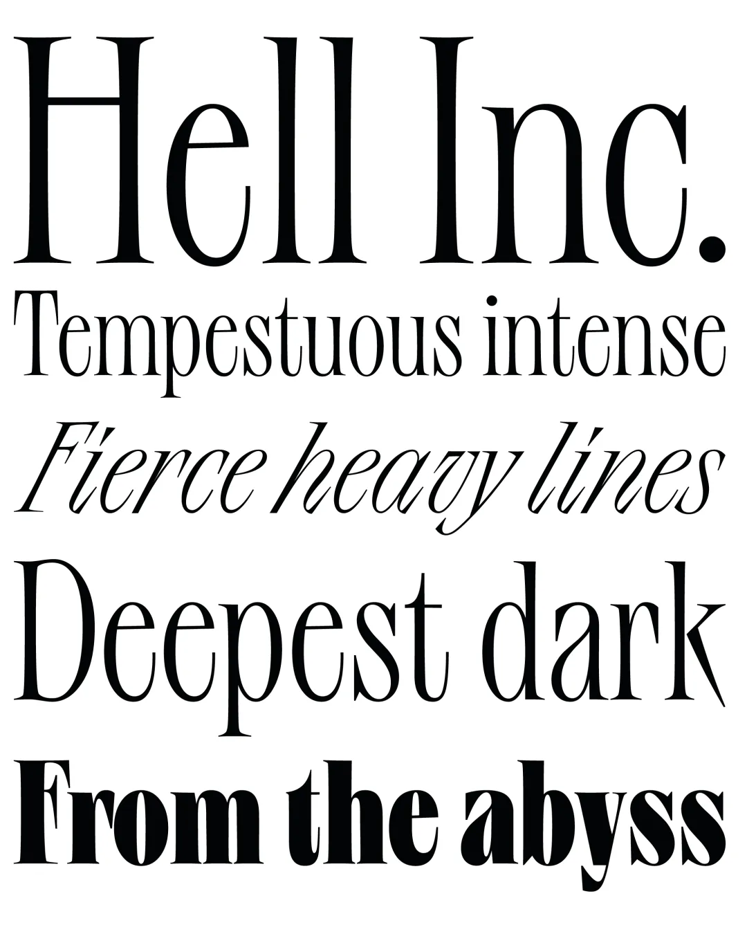
This project began as a way to express hard feelings about deception, misconceptions and delusional thoughts. Hence the tints of psychedelic inspiration.
At some point similarities between Dante’s journey in the Divine Comedy and the progress of Hell.Inc became evident. And this inspired the “subconcept” of the typeface. The Divine Comedy has three main parts: hell, purgatory and heaven.
Hell.Inc, has three instances, each one represents the stages of redemption through weight and proportion. Ultra has intense contrast like tempestuous feelings. Regular finds a way to make peace by reducing the weight and contrast. The Italic is the representation of heaven. The counter forms are more open, the weight is rather light. The sharpness remains and accentuates the link between the family. It’s like an angel risen from hell.
Awards and Recognition
Título
Academic Context
Type West Online
Letterform Archive (Estados Unidos) — 2023