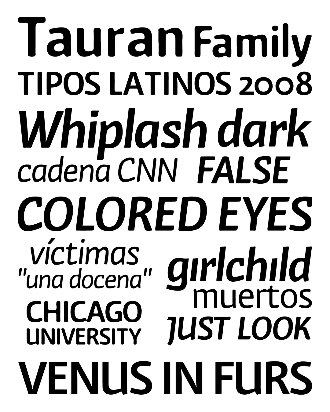
Tauran is a project that was presented at the last biennial; since then, it has undergone a process of refinement and rethinking—not only in its structure but also in its functionality. It is an ideal text font for books, magazines, and newspapers.
One of Tauran’s formal characteristics is that it belongs to the group of modulated sans-serif typefaces. It draws on certain humanistic values from historical typefaces, blending them with more contemporary solutions, which gives it a somewhat eclectic character.
It features a narrow “x-height”; its main axis is vertical, and the ascenders are slightly longer than the descenders. Within the typeface family, the anatomy of each character has been optimized and accentuated to achieve greater differentiation between them, thereby better defining the shape of words.
Plans are in place to introduce additional weights complementary to its design in the future, in addition to those presented in this edition.
Awards and Recognition
Familia
Texto