Borges is a classic text face that combines the dignity and grace of the French Renaissance with a contemporary flavor, close to the Dutch style of the 20th century, that is to say, tall and slightly condensed lowercases with a contrast of strokes barely larger than a garalde. Borges is a humble tribute to the fantastic work of Jorge Luis Borges. His writing technique, that of a meticulous and tireless goldsmith, endlessly searching for the perfect word, suggested a clean and economical letterform. Thanks to its round and open forms, Borges builds a delicate sense of rhythm, providing a comfortable reading in long texts. It was conceived for editorial use, especially in books, although it is suitable for a wide variety of designs. Borges comes in six weights of roman, italic and small cap.
Borges
ID / Record
#2788
Credits
Alejandro Lo Celso
Licensing
Público con costo
Foundry
Pampa Type
Release
2001
Classification
Texto
Class
Retail
Variants
12 Styles
Regional Node(s)
Argentina, Argentina, Argentina, Argentina
Verified Information
Access / License
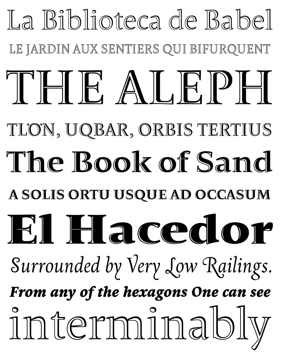
Note. Specimen of the typeface Borges. Copyright by
Pampa Type.
2002
Morisawa Type Design Competition
RECOMMENDED CITATION
TipoMap Latam. (2026). Borges. In Mapping of Typographic Production in Latin America (record #2788). UASLP. https://doi.org/10.58493/tipomap — Entry consulted at https://tipomap.lat/view_typo?id=2788