The lightest weight of Presley Slab takes inspiration from a late nineteenth-century type specimen, but what began as a decorative and delicate contrasted serif stirred Alejandro Paul’s imagination to conjure voluptuous reverse contrasted letterforms. These became the heaviest weight of Presley Slab, which nods to the lacquered hairstyles from the birth of rock ’n roll with its idiosyncratic ball terminals. Its playful allure and swagger remains visible in the weights that stand between these two extremes but as the curls loosened, many things happened in the design process including the appearance of swashes and alternates.
Presley Slab’s personality has breadth; it is a fun, confident and contemporary palette of letters that will perfectly perform for any job, from editorial design to branding. The Extra Bold and Black weights are a powerful option at large sizes for use on posters and billboards; the graceful Thin and Extra Light weights are delicate options for packaging design or fashion branding. Despite it conjuring images of mid-century music halls, Presley Slab is also staunchly European in it’s aesthetic, offering everything from good-humour to elegance with its unique touches.
Presley Slab
ID / Registro
#3175
Créditos
Alejandro Paul
Licenciamiento
Público con costo
Fundidora
Sudtipos
Lanzamiento
2019
Clasificación
Texto, Títulos
Clase
Retail
Variantes
18 Estilos
Nodo(s) Regional(es)
Argentina
Información Verificada
Acceso / Licencia
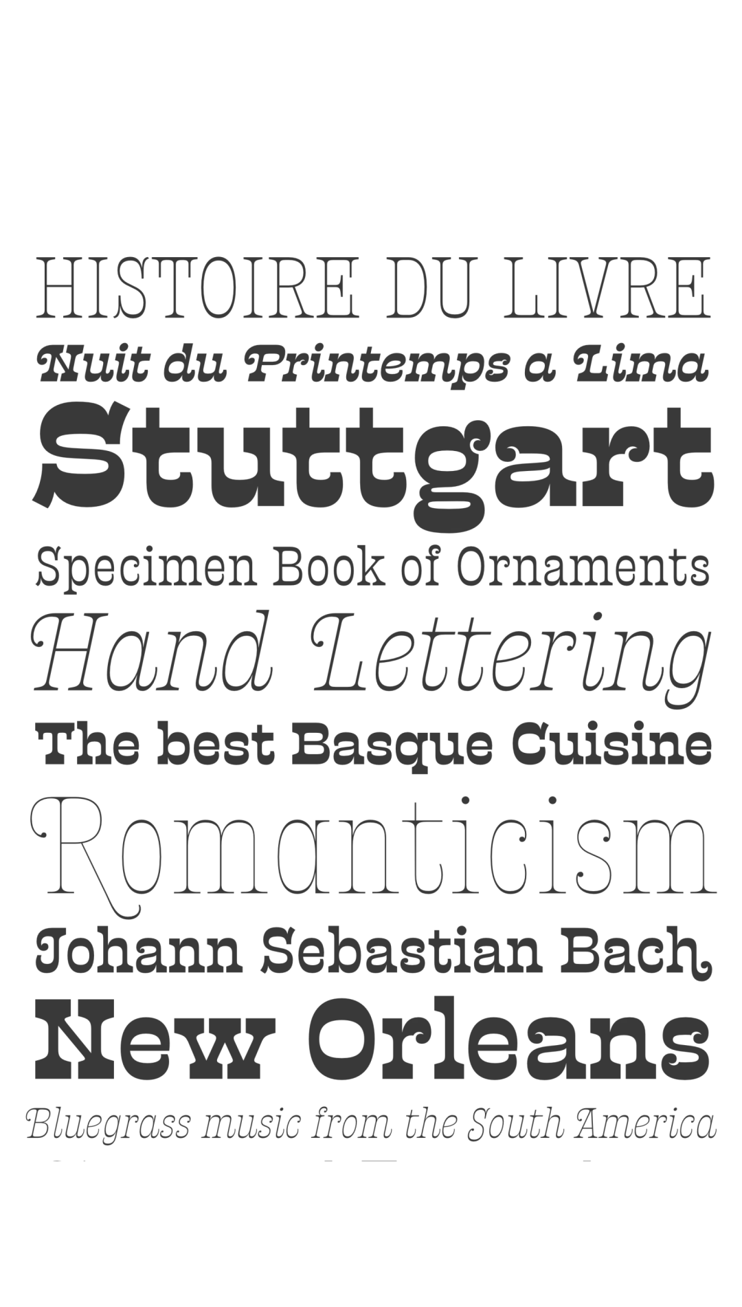
Nota. Espécimen de la tipografía Presley Slab. Derechos de autor por
Sudtipos.
Traducción pendiente - Mostrando original en Inglés
CITA RECOMENDADA
TipoMap Latam. (2026). Presley Slab. En Mapeo de la Producción Tipográfica en SV (registro #3175). UASLP. Entrada consultada en https://tipomap.lat/sv/view_typo?id=3175