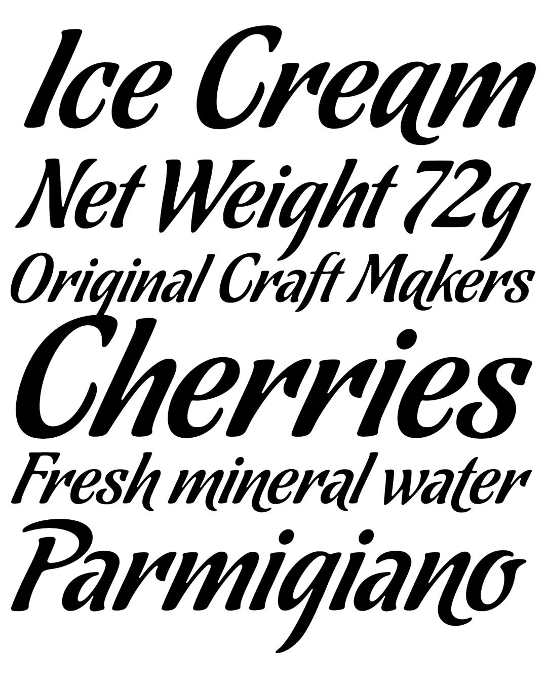
The typeface series developed by the Koziupa-Paul duo is an exercise in visual synesthesia, in which the morphology of the glyphs is used to evoke tactile and gustatory qualities. Through a spectrum that ranges from the precision and contrast of the Amargo variant to the organic fluidity and rounded forms of Dulce, the system offers a range of “visual flavors” adaptable to various communicative purposes. This proposal not only addresses legibility but also explores the semantics of form, allowing designers to select the appropriate chromatic and gestural tone for visual identity projects in the premium consumer goods sector.
Awards and Recognition
2006
Bienal de Tipografía Latinoamericana. Selección
Titulo
Titulo