The Fixture typeface family is an ambitious synthesis of 19th-century industrial graphic design, bringing the robustness of wood type and letterpress signage into the digital ecosystem. With a structure ranging from Ultra Compressed to Expanded, Fixture serves as a “tribute album” to the various strands of the Grotesque genre. Academically, the project stands out for its post-Grotesk nature: a reinterpretation in which each weight and width manifests a dominant trait of its hybrid origins. This aesthetic multiplicity allows the typeface to function as a living historical document, capable of infusing the visual drama of traditional printing into modern, high-fidelity media.
Fixture
ID / Record
#600
Credits
Alejandro Paul
Licensing
Público con costo
Foundry
Sudtipos
Release
2018
Classification
Texto, Títulos
Class
Retail
Variants
74 Styles
Regional Node(s)
Argentina, Argentina
Verified Information
Access / License
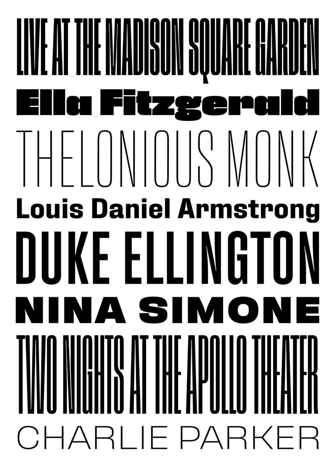
Note. Specimen of the typeface Fixture. Copyright by
Sudtipos.
RECOMMENDED CITATION
TipoMap Latam. (2026). Fixture. In Mapping of Typographic Production in SV (record #600). UASLP. Entry consulted at https://tipomap.lat/sv/view_typo?id=600