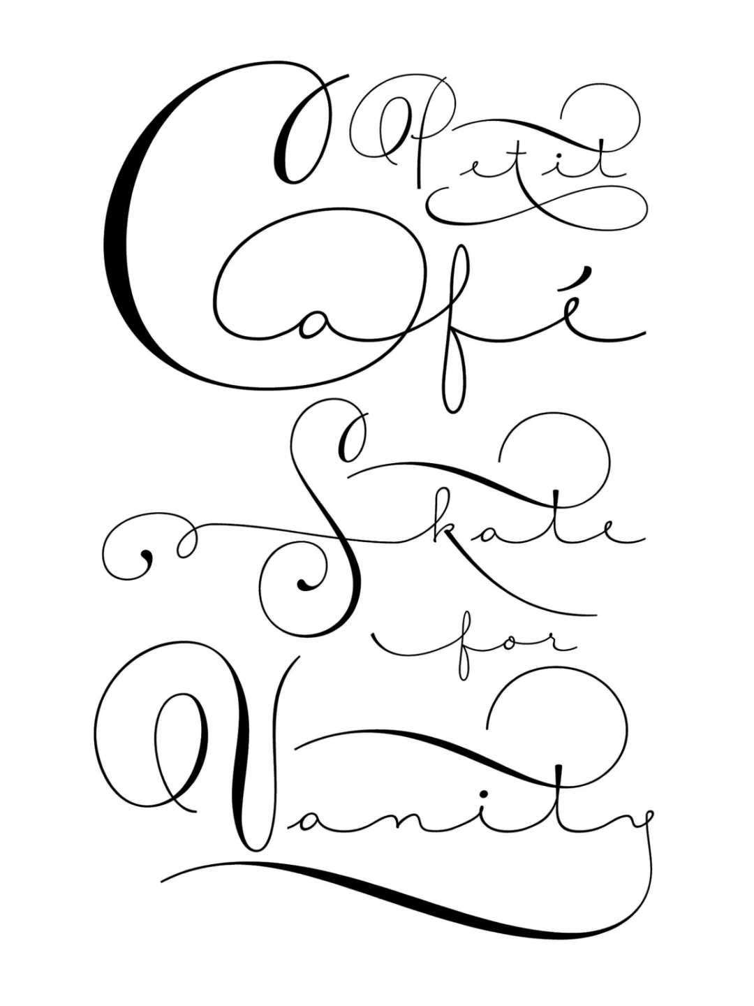
Awards: Courtesy Script has been awarded the Certificate of Excellence in Communication Arts’ annual typography competition.
In keeping with the aesthetics of the Victorian era, personalized calligraphy and handcrafted finishes in fine stationery are experiencing a resurgence. It is in this context that Courtesy Script, an original creation by Alejandro Paul, is presented.
Genealogy and Morphology
Courtesy captures the sophistication and formal rigor of Spencerian calligraphy, with a special emphasis on the canons of the Zanerian school. Its structure features the following technical characteristics:
Lowercase: Defined by remarkable restraint; a simple monolinear stroke with extended connections that optimize legibility in flowing compositions.
Uppercase: The capital letters introduce rich modulation in stroke contrast and varying degrees of ornamentation, ranging from restrained sophistication to the exuberance characteristic of engrossery (display calligraphy).
Glyph Development and Variants
Based on an alphabet found in a 19th-century calligraphy manual, Alejandro Paul has developed hundreds of additional, stylistically consistent forms. The typeface set includes:
Alternate uppercase and lowercase letters.
Lowercase forms with ornamental features (swashes).
Terminal strokes and decorative flourishes.
Numerals, punctuation marks, and extensive support for accented and multilingual characters.
Editorial and Commercial Applications
Thanks to the virtually unlimited customization possibilities offered by its architecture, Courtesy allows designers to create a fluid visual identity with a signature-like character. It is an ideal tool for fine stationery projects, invitations, editorial design (book covers), fashion layouts, and high-end packaging.
Awards and Recognition
Typeface Design