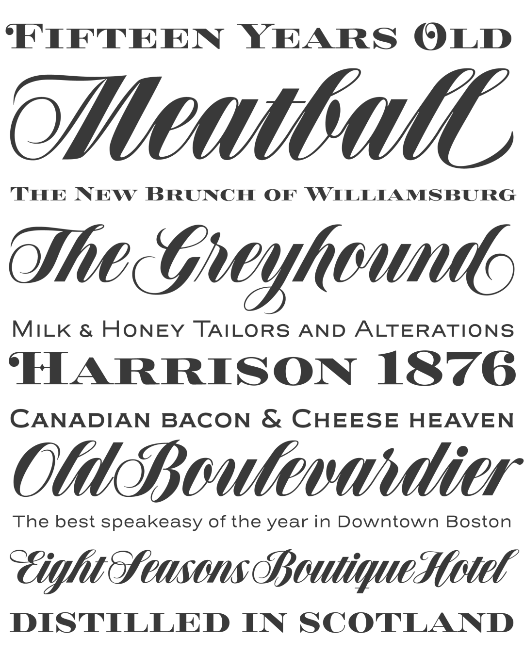
Speakeasy is a 5-font combo thematically built as a toolset for designing menus and liquor labels but also for coffees, restaurants and signs that communicate with style. Originally put together to be used by the most famous speakeasy in Buenos Aires, this set contains a script, a minor (almost flat) wedge serif, a flare serif, a sans serif, and a bold Didone. All the text fonts contains small caps too. The seed for the script was found in a German lettering book, and the other fonts reflect the familiar advertising and announcement styles of the early 20th century.
The Speakeasy script is a connected one, but comes with two different ways to connect the letterforms. It also comes with many alternates, swashes, endings and flourishes — all accessible via OpenType features or glyph palettes.
Speakeasy Modern and Speakeasy Flare are small cap fonts, and come with a few alternates. Speakeasy Sans and Speakeasy Gothic come with full sets of majuscules and minuscules, but contain small caps and a few alternates as well. A few rules and ornaments are also sprinkled throughout the set.
Awards and Recognition
titulo