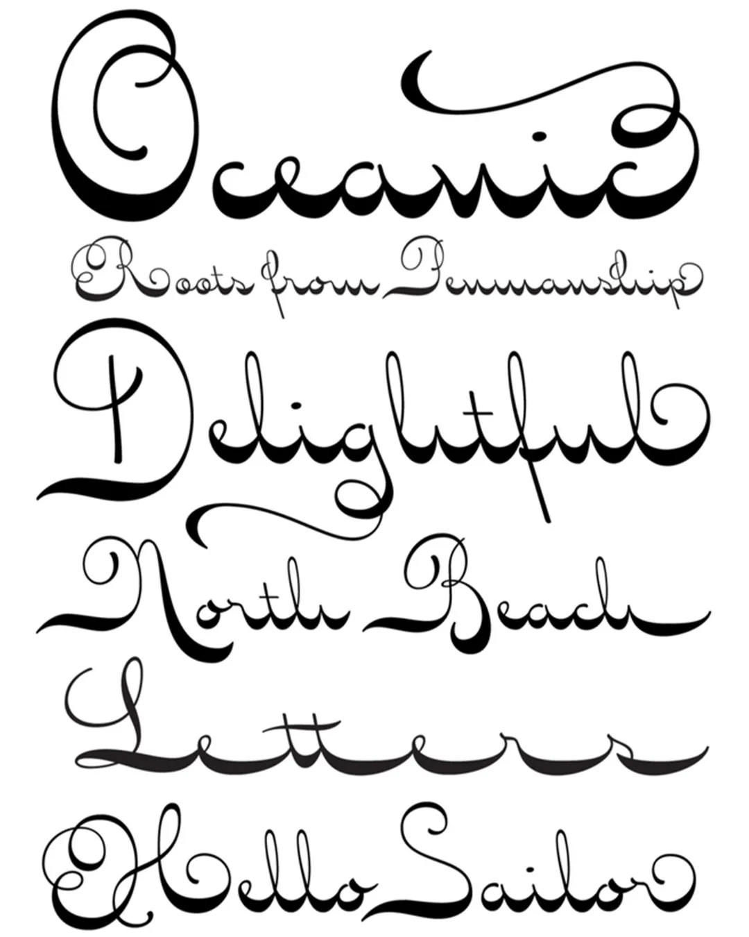
An elegant and graceful typeface with thicker horizontal strokes that create a fluid rhythm—hence its name. Seashore is inspired by an unconventional (left-leaning) calligraphic style from the late 19th century. It was used primarily by expert scribes for certificates and tributes, or by members of high society for their correspondence and invitations. This typeface conveyed a sense of true sophistication, as it could only be mastered after learning the more common styles, such as Spencerian and standard ornamental. In fact, the demand for unique calligraphic styles during that era was so great that type foundries produced a large number of increasingly intricate imitations of metal typefaces.
The Seashore typeface encompasses a wide range of ornate capital letters, alternative serifs, and contextual ligatures, with a total of over 900 glyphs. It is ideal for brief display applications: on names and addresses on formal invitations, on menus and food packaging, or in fashion and beauty contexts.
Awards and Recognition
titulo