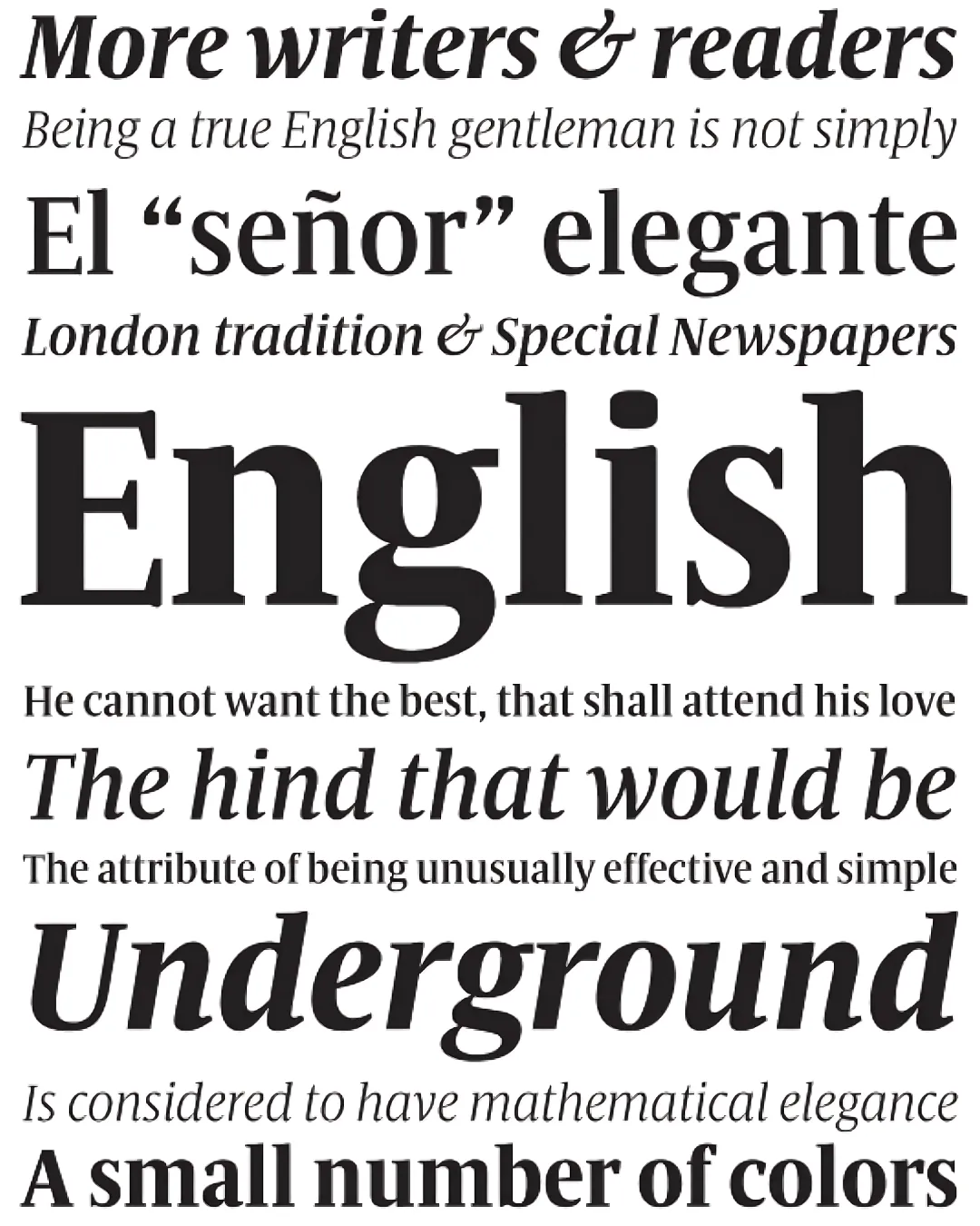
Commissioned by art director Alfredo Triviño for “The Sunday Times.” The first sketches of “Sunday Times Modern” were made in early November 2007, and work began with a more classical approach; the initial drawings were much softer and, to a certain extent, conventional (teardrop-shaped terminals, “normal” proportions, and certain baroque details such as the loop on the “g”). However, following a careful analysis of the competition, it was decided to make a 180-degree shift in the formal design of the characters, changing the serifs, terminals, and many other details, including the character width. “Sunday Times Modern” is used for the headlines in the main body of the newspaper, while in the other sections it serves as a supporting typeface. It is a display typeface and is optimized to work best in headlines between 50 and 90 pt, although it can be used reliably starting at 16 point. The lowercase height is 81% of the uppercase height, which makes it appear larger compared to many other typefaces. It also has very short ascenders and descenders, allowing for tighter line spacing and the creation of compact headlines with greater visual impact. The typeface family consists of six styles: Light, Light Italic, Medium, Medium Italic, Bold, and Bold Italic. It is for the exclusive use of “The Sunday Times” newspaper and will not be available for licensing.
Awards and Recognition
Familia