A grotesque font with a wink, not a grimace.
Cringe Gothic doesn’t shy away from discomfort—it embraces it. With curves that flirt with intentional clumsiness and terminals that defy typographic logic, this sans-serif grotesque feels like an untimely smile: awkward, endearing, and a little absurd. But beneath its unconventional surface lies a solid, compact, and surprisingly versatile design.
Created for an era in which perfection is suspect, Cringe Gothic is designed for brands that prefer to appear vulnerable rather than perfect. With eight weights, from Light to Extra Black, it works well with headlines that demand presence and with design systems that need a playful yet bold voice.
Its exaggerated shapes, wide apertures, and details that look like they were plucked from a viral meme make it a visual manifesto of the post-critical aesthetic: a style that embraces the strange, the emotional, and the absurd as a new kind of honesty in brand-building.
Cringe Gothic
ID / Record
#2101
Credits
Luciano Vergara, Jorge Cisterna, Daniel Hernández, Ale Navarro
Licensing
Público con costo
Release
2025
Classification
Títulos, Dingbats
Class
Retail
Variants
8 Styles
Regional Node(s)
Chile
Verified Information
Access / License
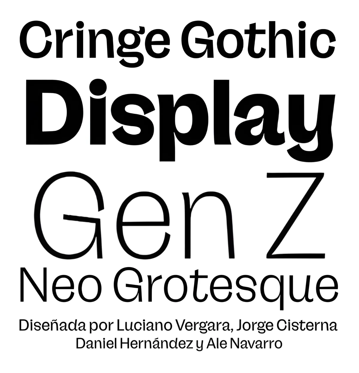
Note. Specimen of the typeface Cringe Gothic. Copyright by
Luciano Vergara, Jorge Cisterna, Daniel Hernández, Ale Navarro.
RECOMMENDED CITATION
TipoMap Latam. (2026). Cringe Gothic. In Mapping of Typographic Production in Mexico (record #2101). UASLP. https://doi.org/10.5281/zenodo.22709940 — Entry consulted at https://tipomap.lat/mx/view_typo?id=2101