Domi is a robust and simple sans-serif typeface. Its design highlights the contrast between the extreme weights—from Thin to Black—through closed forms, straight terminals, and restrained modulation, resulting in a confident and characterful look. Designed by Daniel Hernández for Latinotype, Domi emphasizes the relationship between counterforms and rhythm, achieving a balance that works well in both typographic hierarchies and dense blocks of text.
Its bold uppercase letters expand its versatility in industrial, fashion, cultural, wayfinding, and graphic identity contexts, while the geometrically based lowercase letters provide structural clarity and style. Domi offers a fresh take on 20th-century typographic rationalism, reimagined with a contemporary logic suited to flexible and decisive visual systems. Simplicity allows us to connect more quickly.
Domi
ID / Record
#2102
Credits
Daniel Hernández
Licensing
Público con costo
Foundry
Latinotype
Release
2025
Classification
Texto, Títulos
Class
Retail
Variants
18 Styles
Regional Node(s)
Chile
Verified Information
Access / License
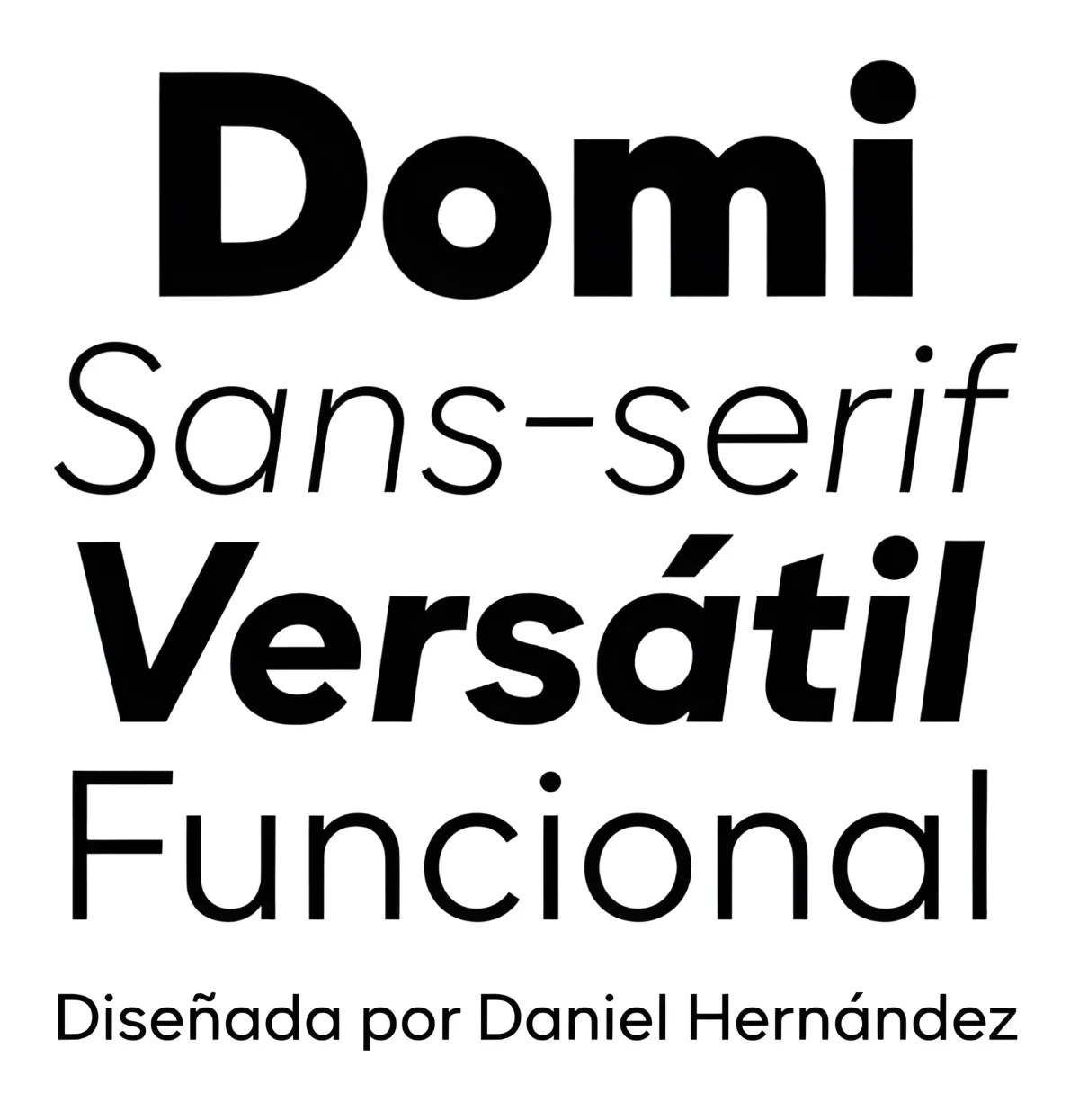
Note. Specimen of the typeface Domi. Copyright by
Latinotype.
RECOMMENDED CITATION
TipoMap Latam. (2026). Domi. In Mapping of Typographic Production in Mexico (record #2102). UASLP. https://doi.org/10.5281/zenodo.22709940 — Entry consulted at https://tipomap.lat/mx/view_typo?id=2102