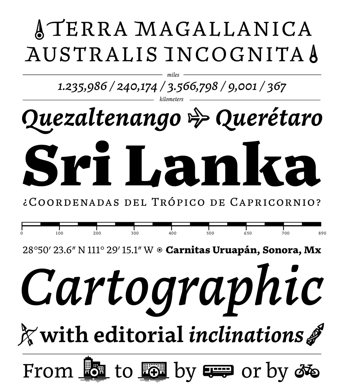
The Noort typeface family, designed by Juan Bruce, transcends the fields of wayfinding and cartography to establish itself as a comprehensive tool for organizing information and creating meaningful reading experiences. Its fundamental purpose aligns with that of the information designer: to bring clarity and style to contexts where the volume of data can be overwhelming. The typeface articulates visual hierarchies with strength and gains greater presence through the use of layered color, establishing an active role within editorial design.
From a formal standpoint, Noort incorporates established features of editorial text design, such as a high x-height, generous letter spacing, and low contrast, which enhance its readability in long paragraphs. Its extended serifs, wide proportions, and strong typographic presence contribute to a comfortable reading experience even at small sizes. These features, along with its five carefully balanced weights, give the typeface versatility and the ability to emphasize the importance of information.
Awards and Recognition
Tipografía
texto
Type Design